Layering Gelli Prints With Stencils and Stamps
Nov 25, 2025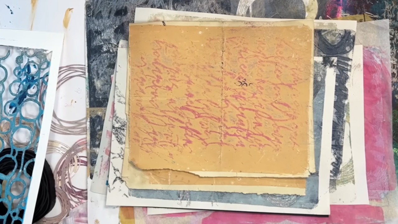
In this tutorial, I’ll show you how to use stencils and stamps to create beautiful layered gelli prints.
We'll explore techniques like ghost printing, lifting paint with tissue, and layering light and dark tones to add depth and interest to your work. You’ll also learn how to custom blend a paint palette inspired by Pantone colours.
From stamping and stenciling to layering and even fixing mistakes, I’ll show you how to build a brilliant collection of prints—and then how to transform them into a finished painting.
This is the first in a 3-part series, so follow along, and I’ll show you how it’s done!
Watch the full video tutorial here:
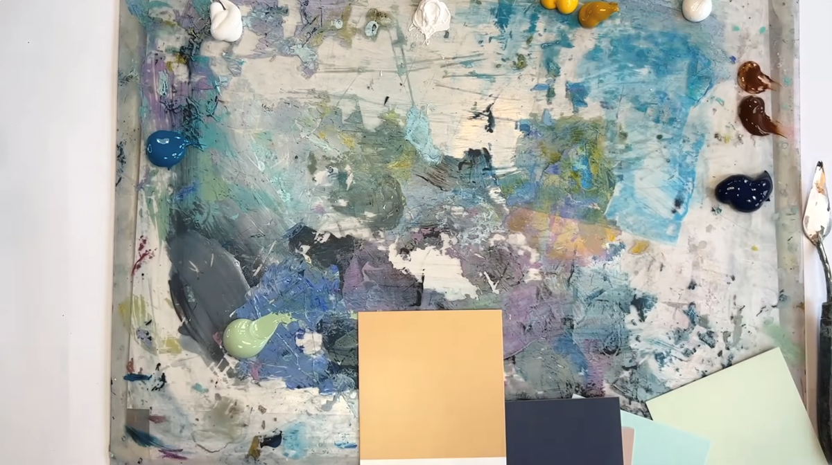
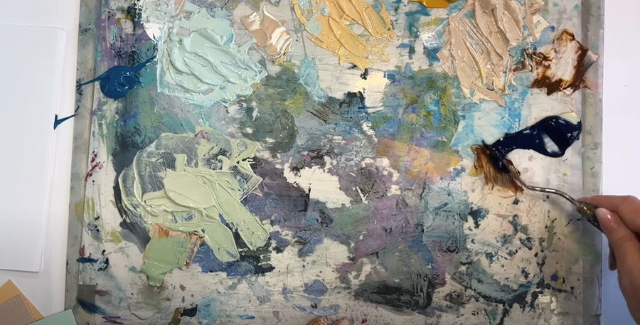
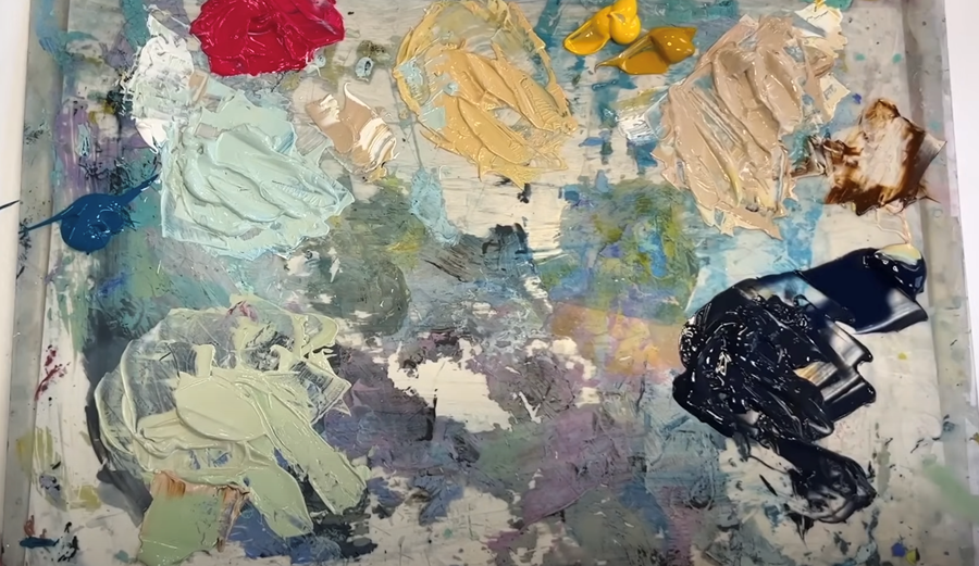
Materials You’ll Need:
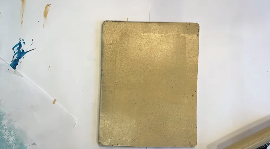
Gel plate:
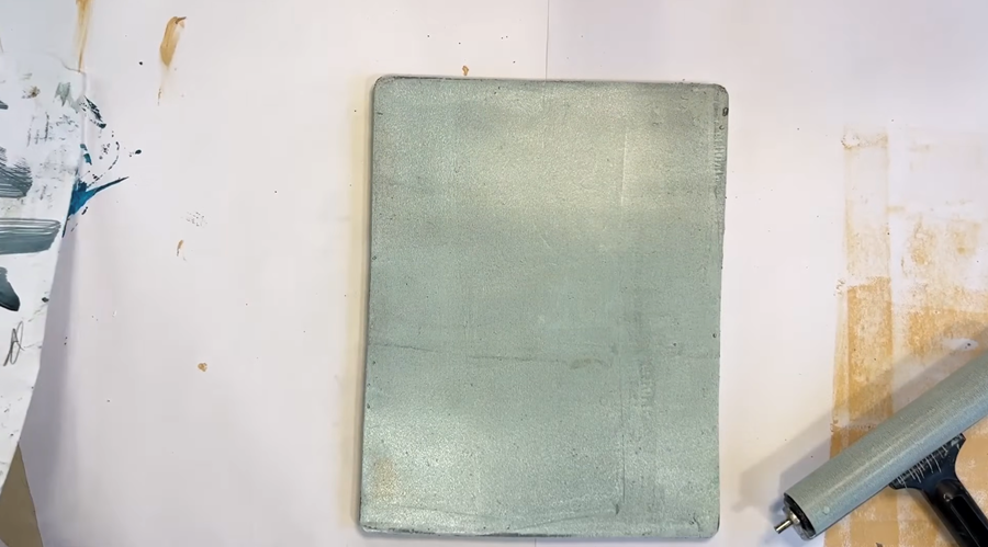
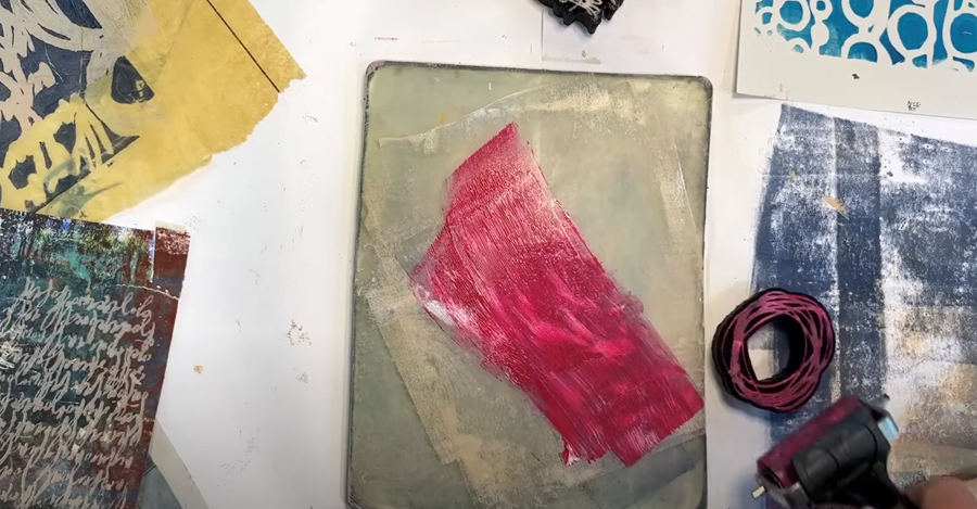
I’m working with my 8 x 10 Gelli plate for this printing session. It’s a great size for a variety of prints.
Acrylic Paint:
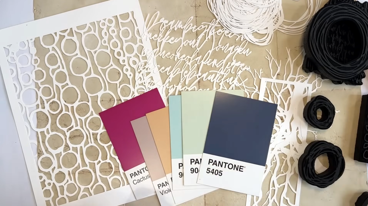
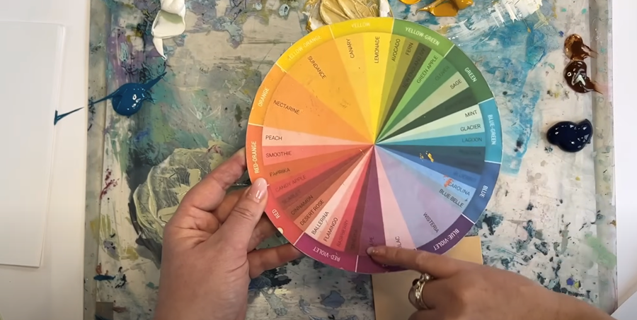
While you can certainly use paint straight from the tube, I’m custom blending a beautiful colour palette selected with Pantone cards, combining cool greens, warm yellows, and a pop of pink.
These are the colours I’ll be using: Pale Olive, Turquoise, Burnt Umber, Naples Yellow, Yellow Ochre, Prussian Blue, Titanium White, Permanent Rose, and Fluorescent Pink.
Paper:
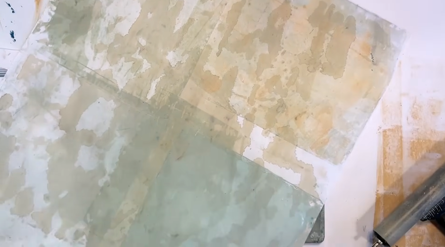
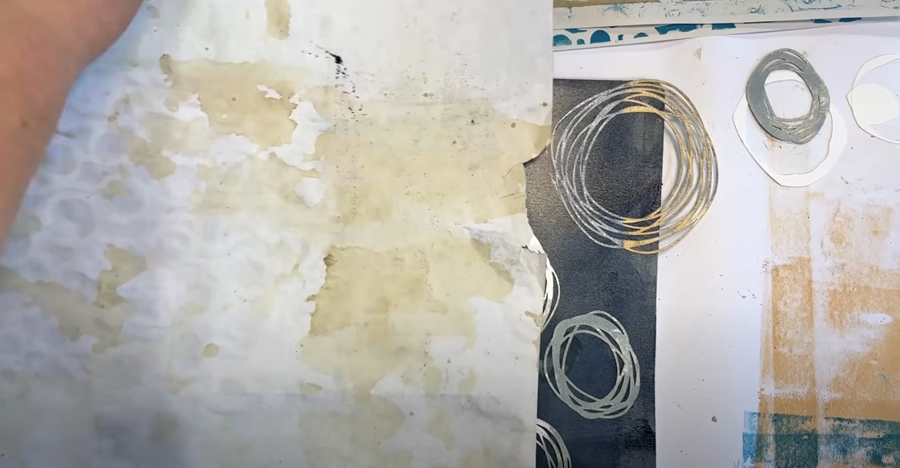
I’m using a mix of papers to create some unique textures and layers. I've got sketchbook paper, newsprint, and some wet-strength tissue paper as well as some existing prints or papers that just have a bit of paint on them. Finally, for a lovely, warm neutral look, I’m including dressmaking pattern paper and some sheets I’ve dyed with coffee.
Tip: When working with delicate papers, move quickly before the paint dries. Otherwise, the paper might tear or stick to the gel plate.
Tools:
You'll need a few tools: a palette knife and a mixing palette for your paints, as well as a brayer to roll the paint onto your Gelli plate. You'll also need a clean spare brayer or a baren (a round, flat tool) to gently press your paper onto the plate.
Tip: I’ve covered my baren with fabric because I didn’t like the scratchy noise it made!
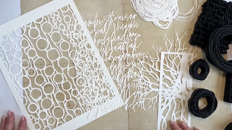
Stamps & Stencils:
These lovely stamps and stencils were gifted to me by Patricia and Maria, the two ladies behind PM Artist Studio. They’ve got an incredible range of stencils with loads of designs to choose from—I'm excited to give them a go!
If you fancy trying them out yourselves, you’re in for a treat—I've got a discount code I'll drop at the end of the blog.
Please note: As an Amazon Associate, I earn from qualifying purchases.
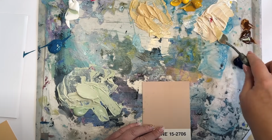
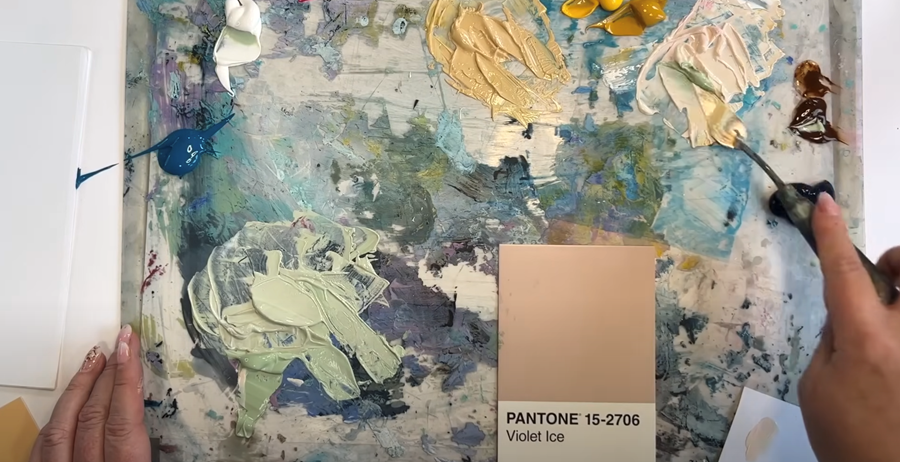
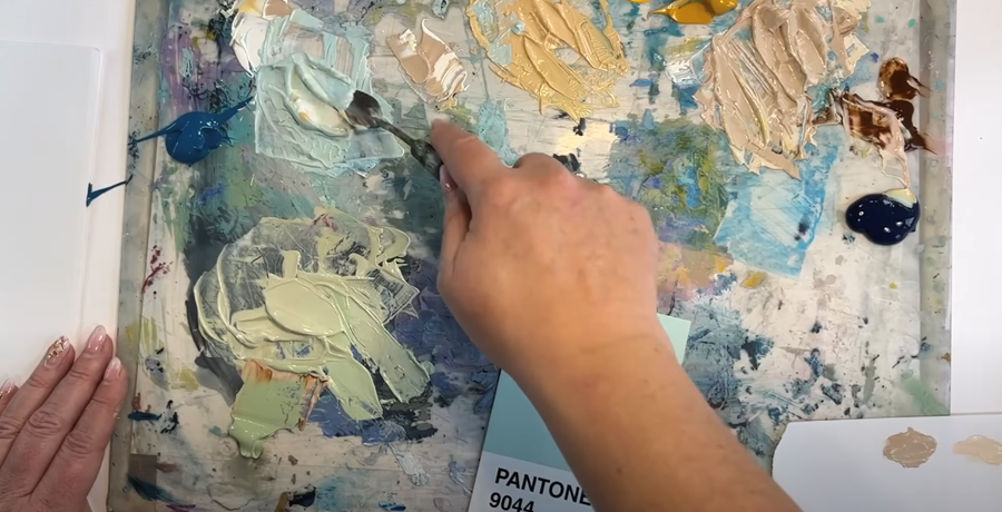
Step 1: Mixing the Paint
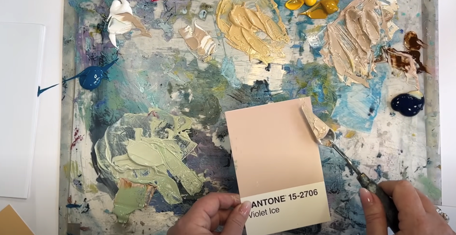
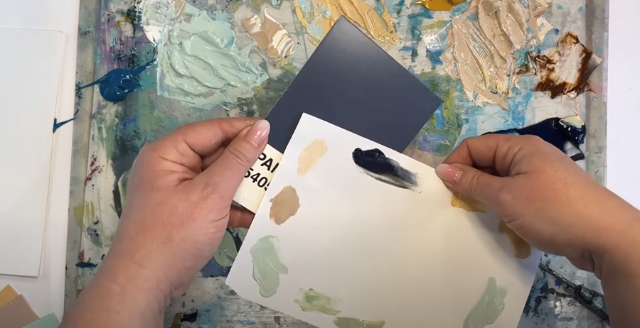
I'm going to show you how I carefully test and mix shades to match this nifty Pantone card palette—a tip I picked up from artist Tara Axford.
What's the secret to mixing colours? It's patience!
Just keep going, adding bit by bit, until you get the shade you want.
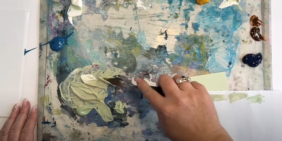
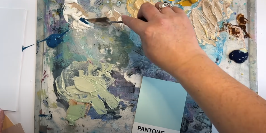
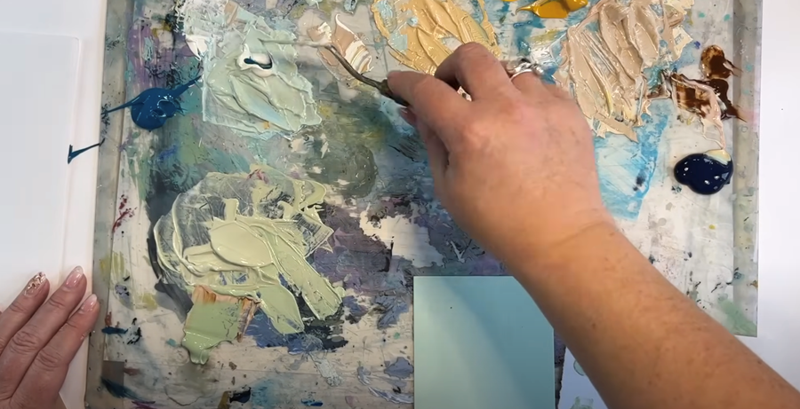
For my palette, I use a large sturdy board with a sheet of white paper taped on top so I can see the colours properly, topped with a piece of perspex/plexiglass.
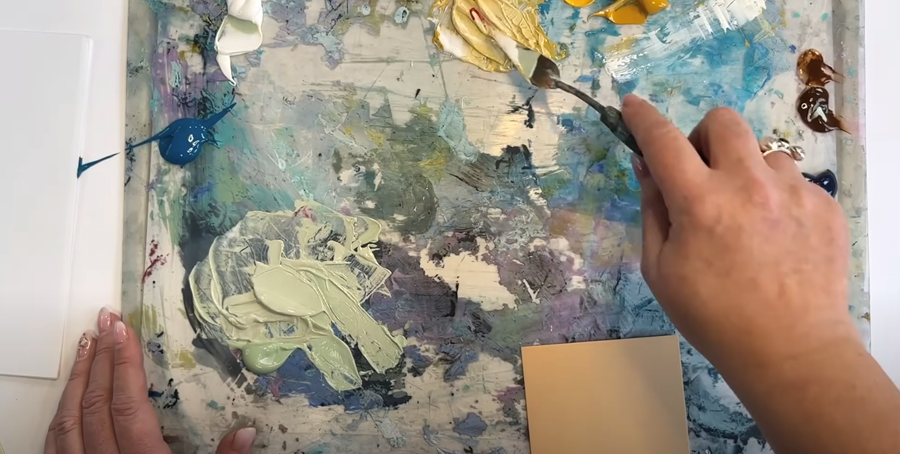
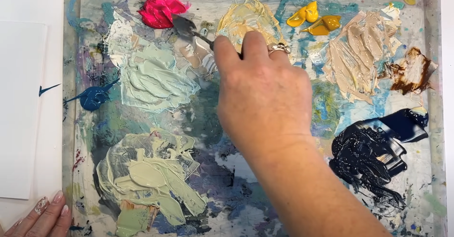
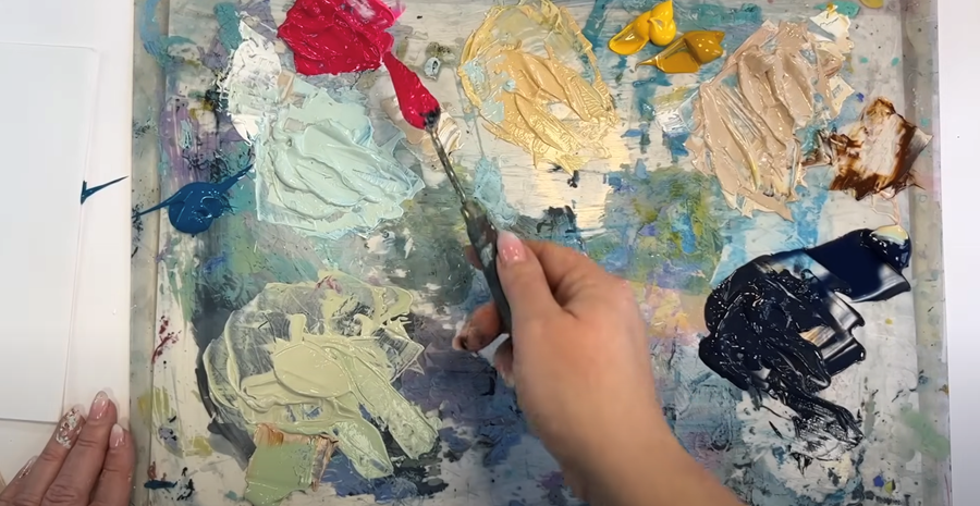
To start, pop a small dab of each paint onto your palette, keeping the darker shades off to one side.
Light Green
I’ll start things off with this light Pantone Green. It’s quite close to a tube of Pale Olive green I have on hand, though I think it could do with being a touch lighter. I start by mixing a bit of titanium white into this green to see how that goes.
It's still a bit too saturated, so I mix in a tiny touch of pink.
Tip: I'm using Permanent Rose, a highly pigmented paint. Keep in mind that a little goes a very long way!
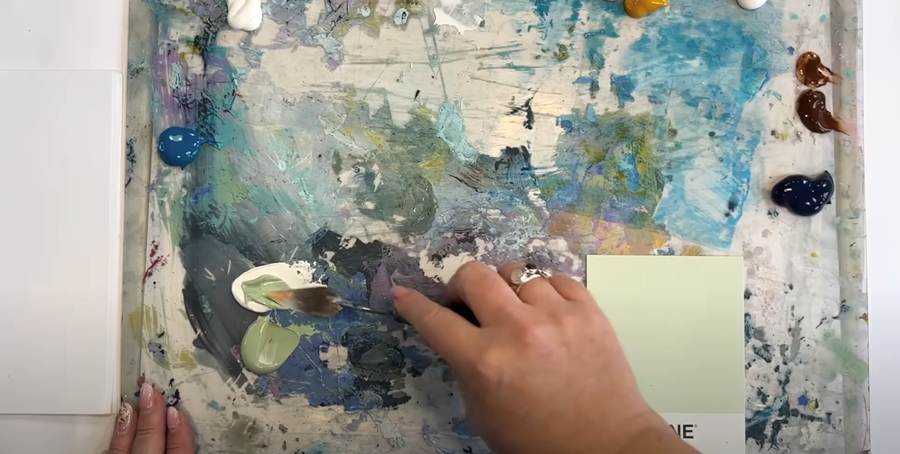
I can see it’s still too green, even with the pink added. To soften it up, I mix in a touch of burnt umber, then gradually add more white—a little at a time—until I’ve got a lovely light shade that’s almost a perfect match for the Pantone green.
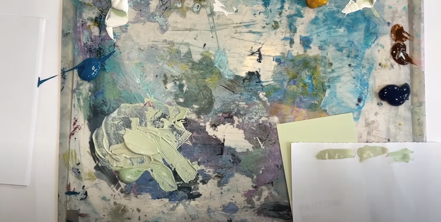
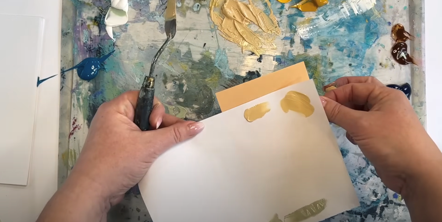
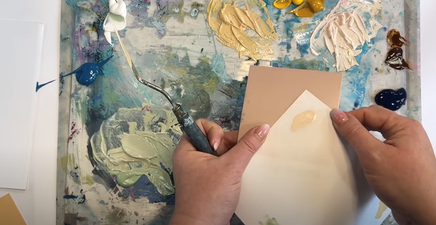
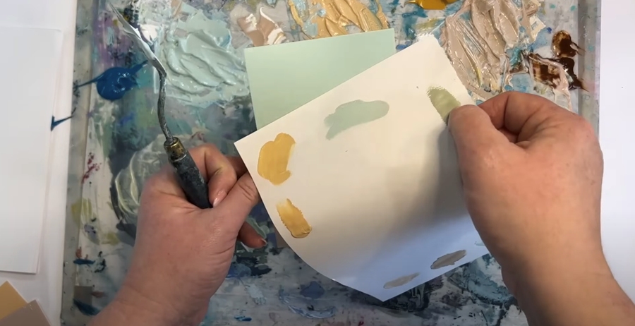
Tip: Keep a scrap of paper handy to test your colours as you go. It’s a quick and simple way to ensure you’re getting just the right shade!
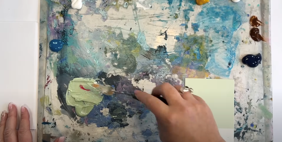
Yellow
To match this Pantone yellow, I’ll begin by mixing Yellow Ochre with Naples Yellow, while leaving a small amount of the pale olive on my palette knife. This little blending trick helps the whole colour palette become more harmonious.
Next, I'll add some Titanium White to lighten the colour up.
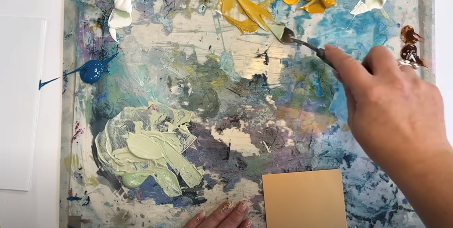
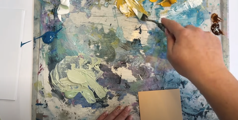
It’s still a bit too saturated for my liking, so I turn to the colour wheel. The opposite of yellow is a purply-pink, so I’ll add a bit of pink to warm up the yellow.
That’s looking close now!
Beige
This next one is a bit more of a coffee color so I'm going to start with mixing burnt umber into the white, along with a bit of yellow from my palette knife and see how that goes. Again, this colour has quite a lot of warmth, so I add a touch of pink.
When I do my swatch test, I can see it's still not quite right.
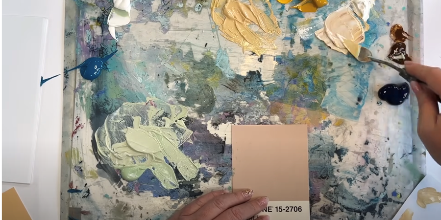
It's still a bit too light, so I add a bit of green, and then some brown and pink to warm it up.
This is where you've got to be patient and just keep going. In the end, I'm really happy with the colour I achieved - I think it's pretty close!
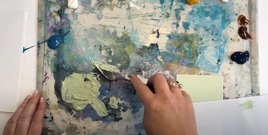
Duck Egg Blue
Using a clean palette knife, I mix a bit of turquoise with white. At first, I add a touch of Naples yellow, but then decide my pre-mixed yellow is a better choice to keep the palette harmonious.
The goal is this lovely duck egg blue, but when I test it against the card, I can see it’s gone a bit too saturated.
I'll need to do a bit more mixing.
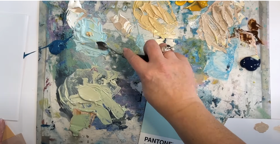
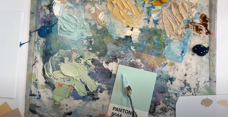
I add a bit more white, a touch of the yellow mixture, and some of turquoise to brighten it up a bit.
Testing it again, I can see it’s almost spot on!
Prussian Blue
Next up is a deep blue, which happens to be a really close match to my tube of Prussian Blue. I don't need to do much to it, but I think I’ll add a wee bit of brown and a little touch of pink, just to give it some warmth.
Pink
The last colour on our palette is pink. I’ll mix a bit of Permanent Rose with some Fluorescent Pink to keep it bright and vibrant. I don’t want to add anything else, as I’d like the pink to really pop as an accent colour in the finished pieces.
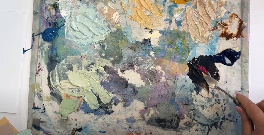
Right then, I’m really pleased with how the colour palette has come together.
Now for the fun part—let’s get printing!
Step 2: Building Your Base Layers
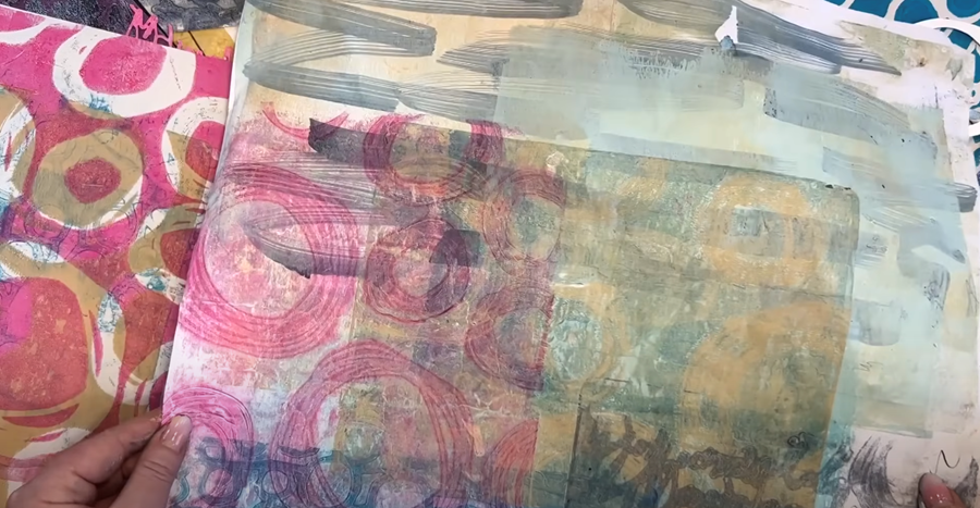
To start, I’m laying down some solid base colours using the Gelli plate. These soft, layered backgrounds are perfect for building up detail later with the stencils and stamps. You’ll see me doing this quite a bit—either creating foundations on blank sheets or adding layers to existing prints. These papers are so versatile and always come in handy for future projects!
Yellow
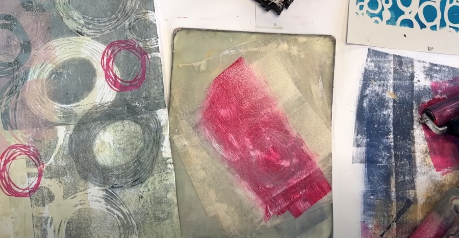
First, I’ll roll out some of our yellow paint onto the Gelli plate and pull it up using my coffee-stained paper. It’s quite a large sheet, so I’ll do it in two parts to cover the whole surface.
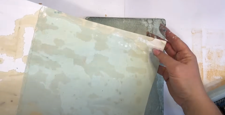
After pulling the first print, there’s usually a bit of paint left on the Gelli plate. This can be picked up as a “ghost print,” which is much fainter. If you work quickly, you can often get two ghost prints before the paint dries. Here, I’ll pull the ghost print onto a paper that already has a design to add some extra interest.
Duck Egg Blue
Next, I’m going to try some of our duck egg blue on this coffee-stained 90 GSM SketchBook paper, which is a lovely paper for collaging with.
I layer the prints, trying to fill the whole page, to create an interesting base layer.
You can mix in a touch of the other colours from the palette (here, I’ve added a bit of yellow) to create harmony and a bit of added interest.
I do the same with my printed paper, pulling up prints to fill the page and creating an interesting base ready for our stencils.
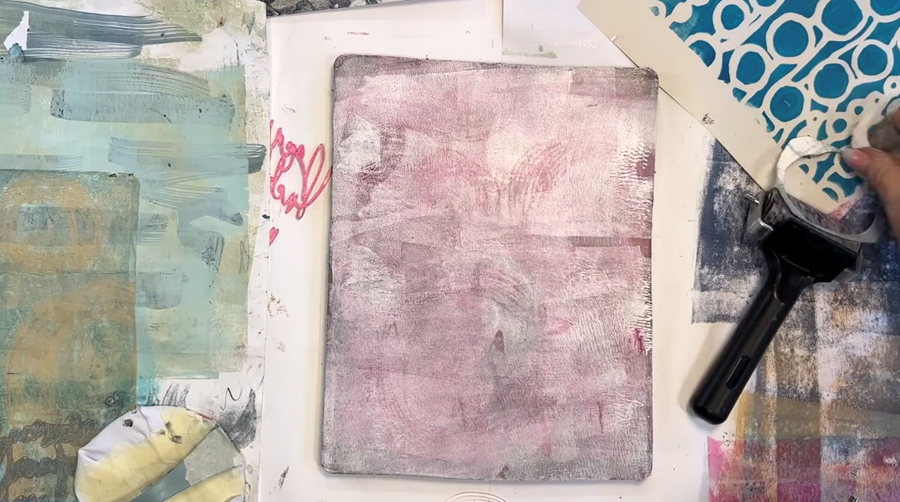
Beige
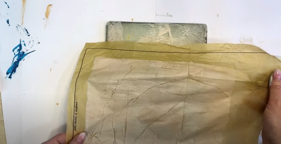
Now, I’m pulling up some beige paint onto this brown dressmaking paper.
TIP: This paper has two sides, and I find the non-shiny side picks up the paint better.
I really like the creases that form when you print on this paper!
Next, I’m using a blank sheet of newsprint to pick up the ghost print. Once again, it’s going to make a lovely background for another print.
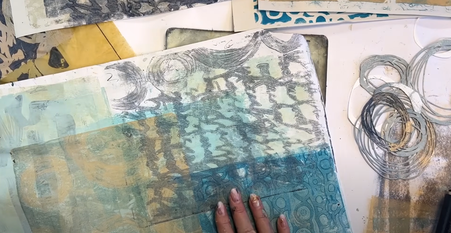
Step 3: Adding Layers With Stencils
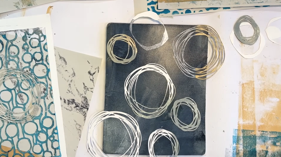
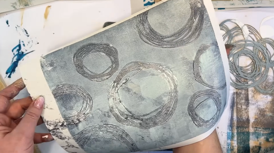
Circles
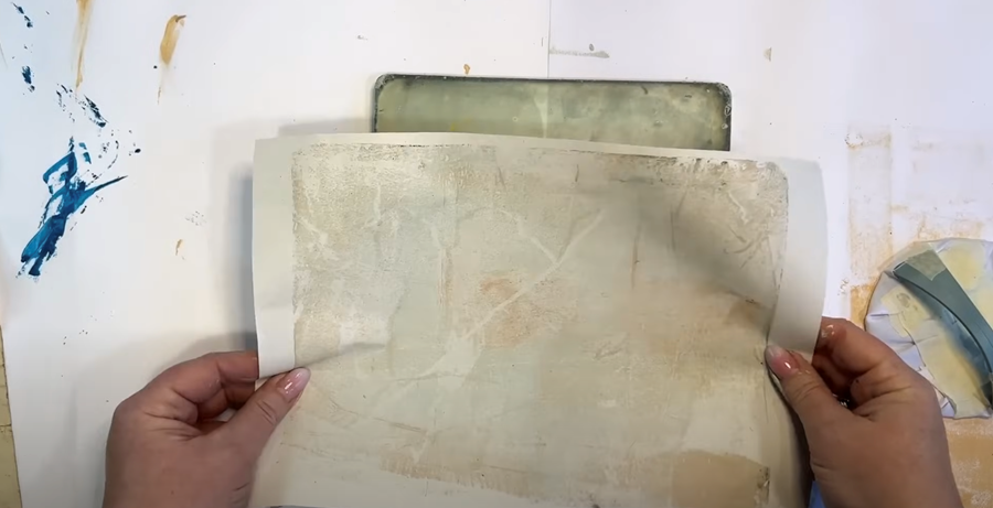
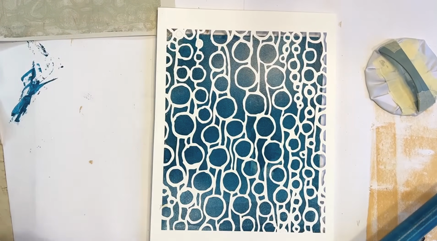
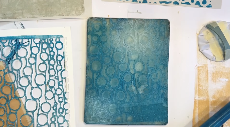
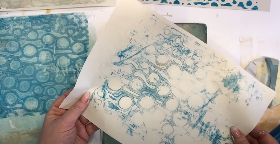
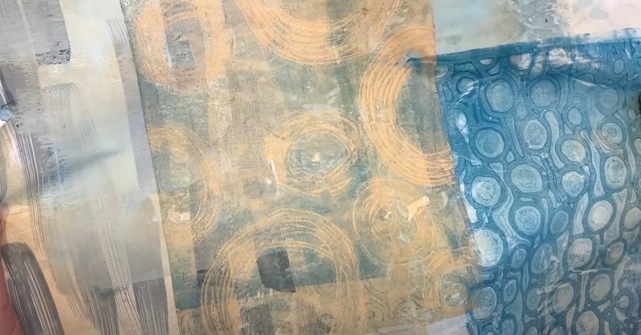
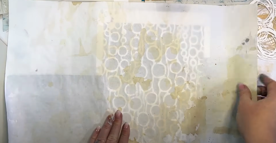
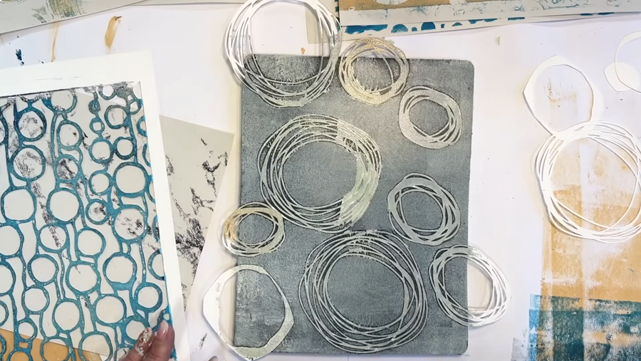
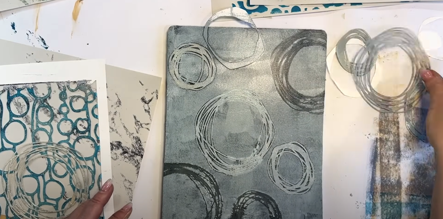
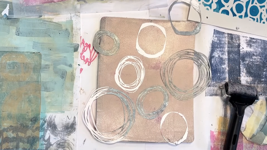
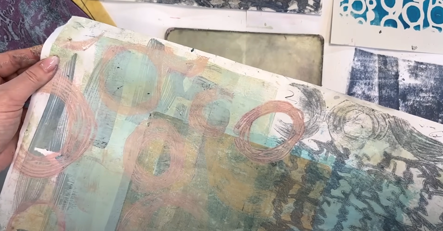
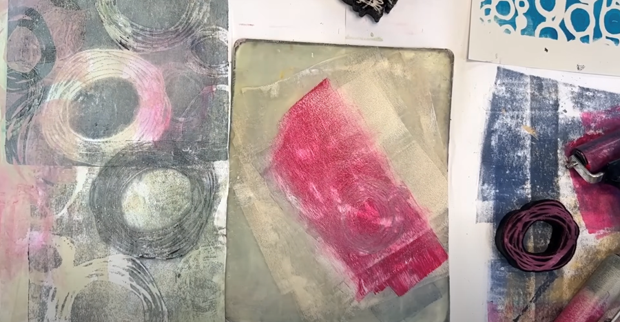
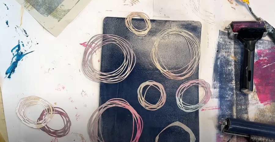
Now that our base papers are ready, it’s time to experiment with stencils! I’m starting with duck egg blue paint on the Gelli plate, paired with this lovely circle-patterned stencil.
It's actually the ghost print that I'm most interested in here, so I’ll first use a piece of wet-strength tissue to lift the initial print—this will makes a wonderful layering element for another print

Next, I’ll pull the ghost print onto a lighter-coloured paper.
The combination of the subtle duck egg blue and the softer toned paper creates a beautifully delicate effect.
Next, I’ll try a bolder colour, like our turquoise.
Just like before, it’s the ghost print that I'm most interested in. For the initial pull, I’ll use a sheet of blank newsprint to capture the stronger print, leaving behind the lighter ghost impression on the Gelli plate.
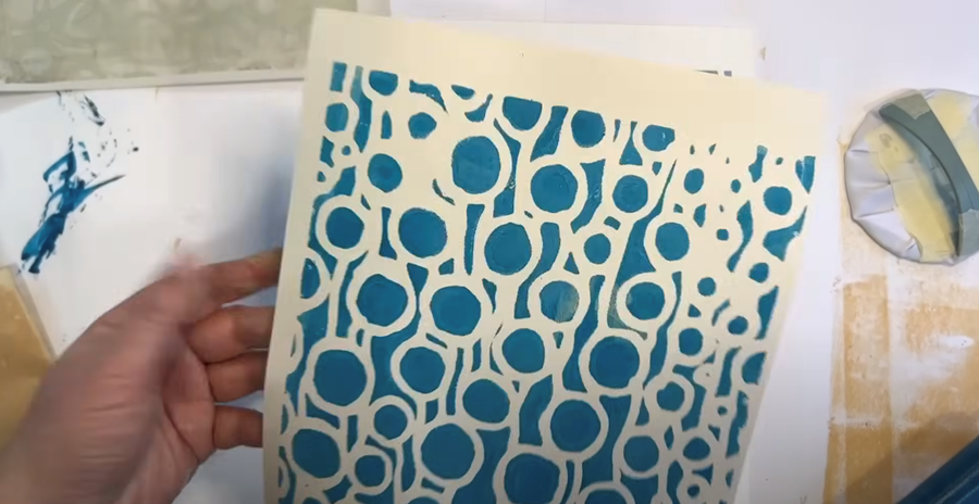
I think the turquoise ghost print will look perfect layered over the duck egg blue on my larger sheet.
I might even manage a second ghost print from the same layer, so I’ll try again with some newsprint.
TIP: Ghost prints can dry quite quickly on the Gelli plate, so it’s important to work fast. If the paint does dry, don’t worry! You can rescue it by adding another thin layer of fresh paint on top and pulling the dried layer up with the new one.
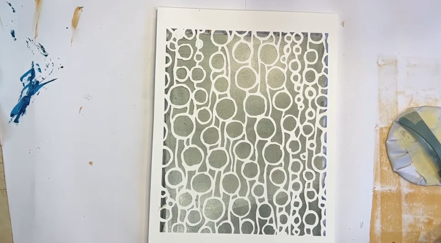
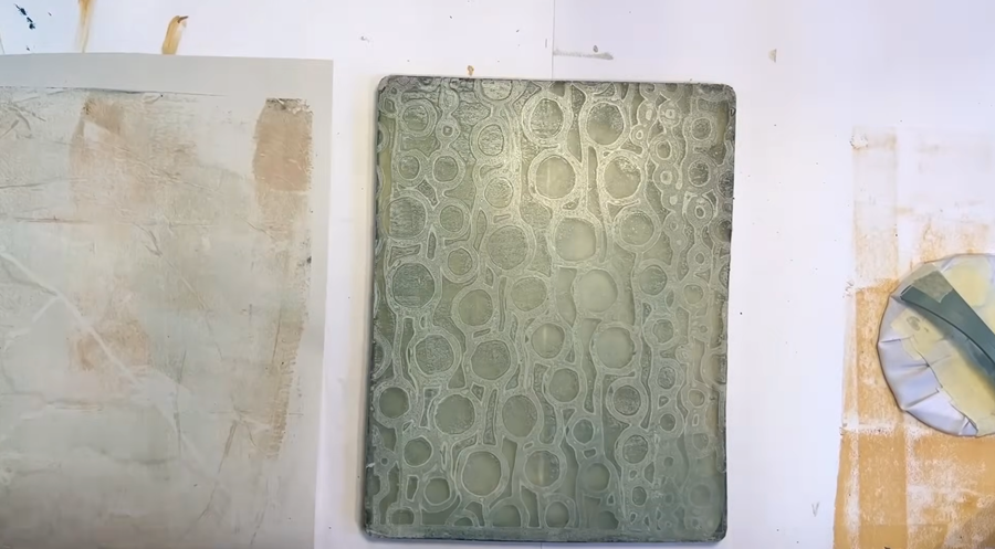
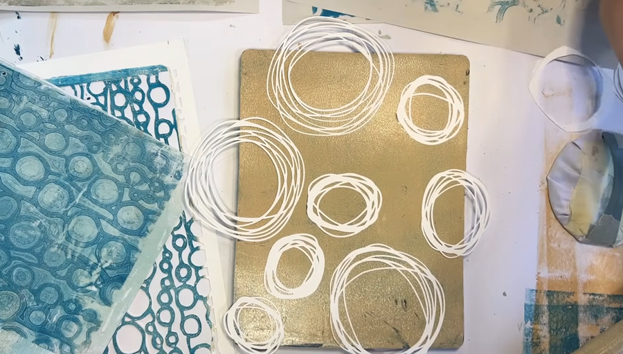
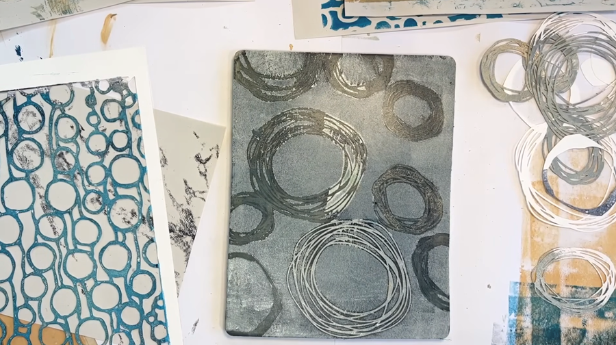
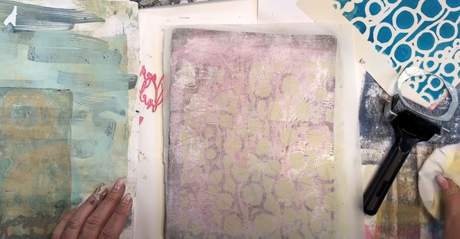
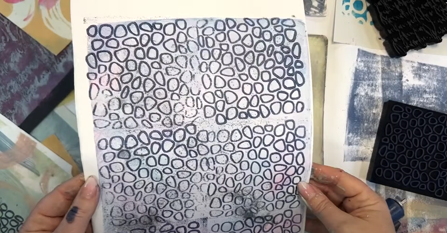
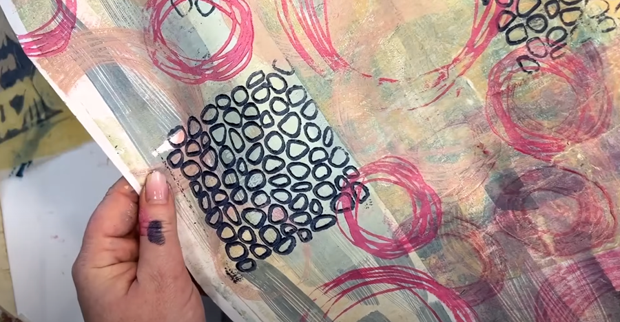
Nested Circles
Now I’m going to try some of these single nested circle stencils. They’re such lovely organic shapes, which I really enjoy using, and I think they’re going to look great.
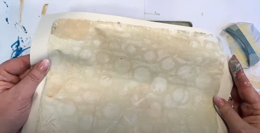
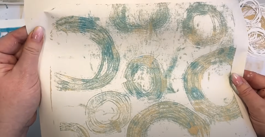
I start by rolling our yellow colour on the Gelli plate, placing the circle stencils on top, and pulling the first impression onto an existing print.
Again, it’s the ghost prints that interest me here, so I'll work on pulling those next.
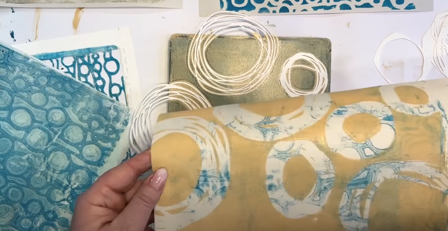
I remove the circles and pull the ghost print onto my large sheet. Then, I pull a second ghost print onto a piece of newsprint to capture those softer textures - I think it looks great!
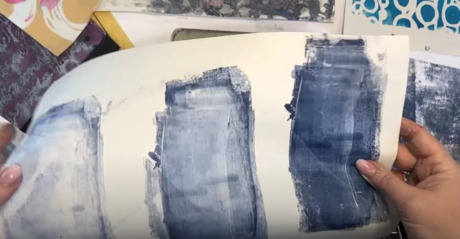
I think we need a few darker base backgrounds as well to use as layering pieces.
First, I pull a solid blue base onto one of my large prints.
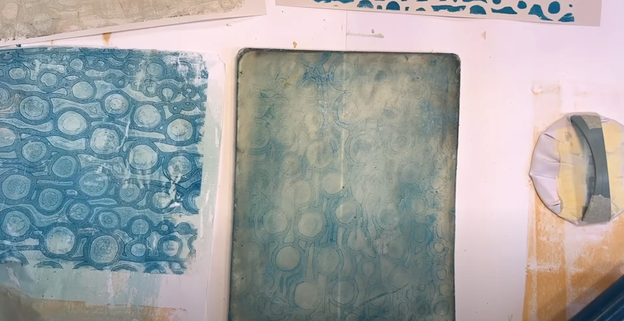
Then, I add the circle stencil to the remaining blue paint on the Gelli plate and pull the ghost print onto my coffee-stained paper. This will create another interesting base layer to build on.
After I pull that print and remove the stencil, I'm left with a lovely circle-patterned ghost print that I’ll pull onto my coffee-stained print.
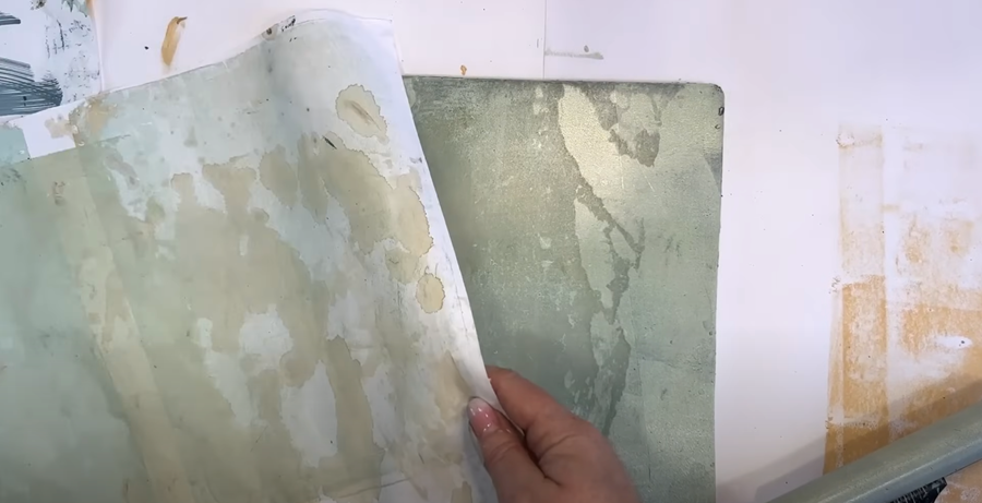
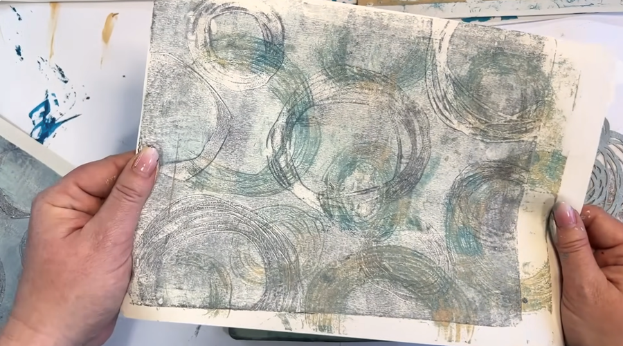
The layers are building up beautifully, with a bit of beige and duck egg blue peeking through, creating a rich, textured effect that I love.
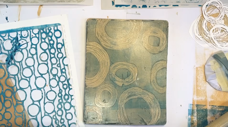
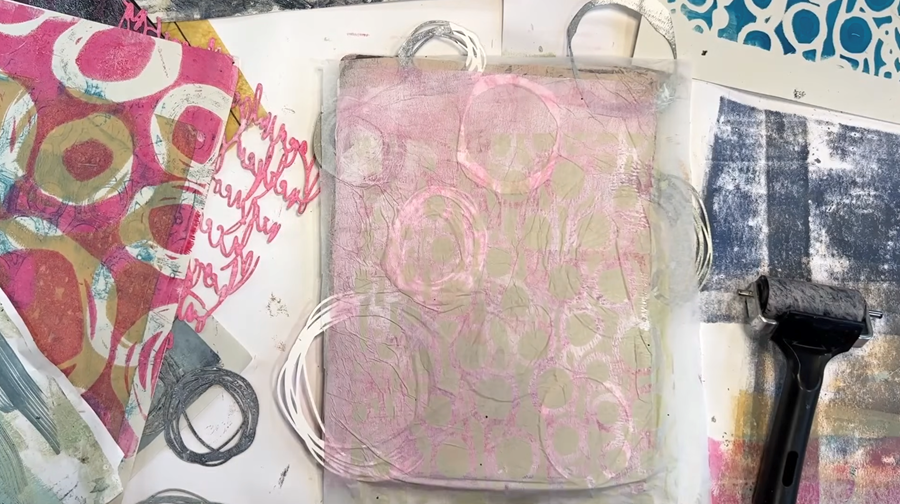
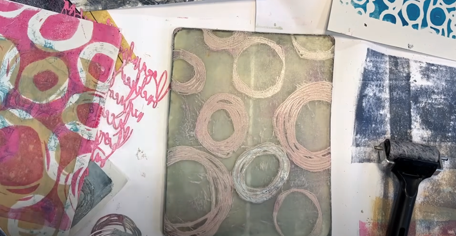
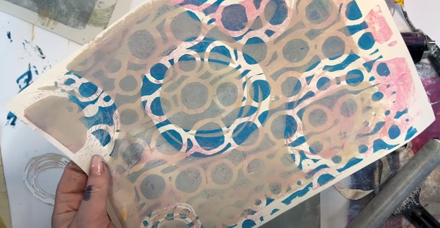
Next, I'm going to place the nested circle stencils in between light and dark paint colours, creating a two-toned effect.
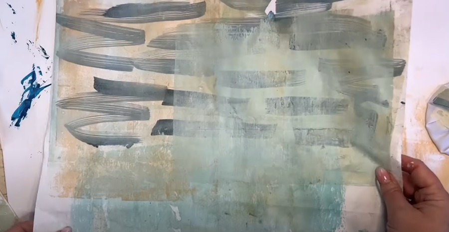
I start by rolling a layer of Prussian blue onto the Gelli plate, lay the stencils on top. After that, I cover everything with a layer of pale green paint.
Then I remove the stencils to pull my prints.
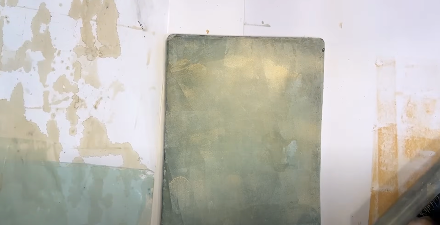
Next, I pull the print onto some coffee stained paper. I love the how the contrast between the two colours give such a lovely depth to the print.
Then, I pull the ghost print right beside it. Side by side, you can really see the difference between the initial print and the ghost print. I love how they look! They're going to make beautiful elements in a finished painting.
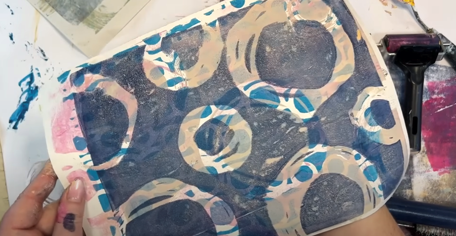
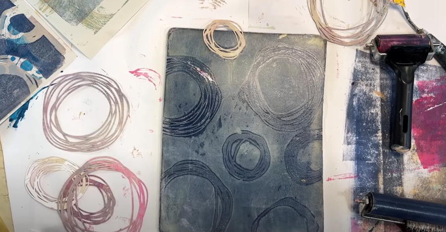
I’m doing another layer of Prussian Blue, again with the circles on top.
TIP: I'm not cleaning the roller too much in between, which means I’m getting some nice blending and harmony between the colours in my palette.
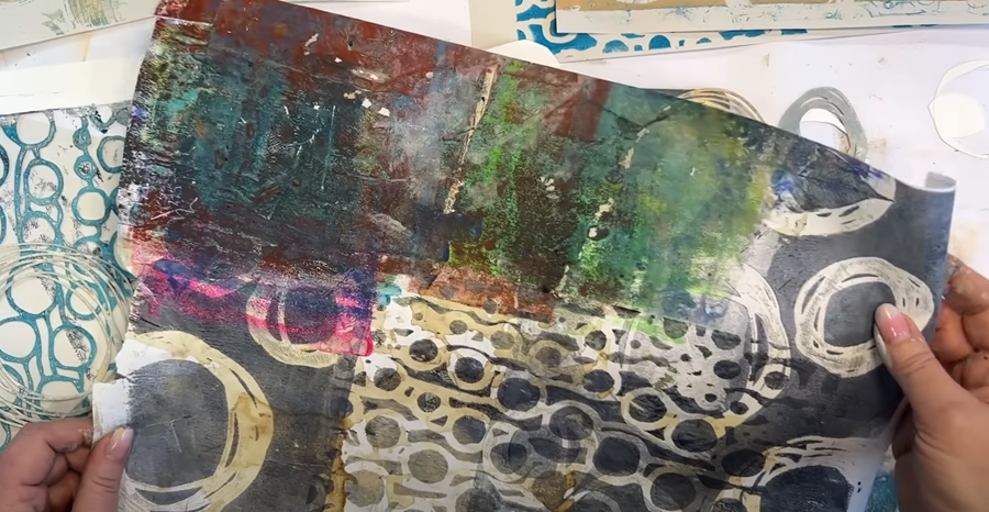
When you’re pulling prints, don’t feel you need to use the whole page – you can pull prints over half the page or just parts of it. Often you'll find it's the overlapping areas that create the most interesting effects!
For example, this paper came from a workshop where someone used it to clean their brayer. They used colours I don’t often work with, so I thought I’d use it to create something a bit different.
Next, I apply some of the duck egg blue paint over the top of the stencils, and then remove them to reveal the Prussian blue layer underneath.
I pull the main print first, which has a beautiful two-toned effect.
Finally, I pull the ghost print over an earlier ghost print, creating such an interesting effect with multiple layers and textures.
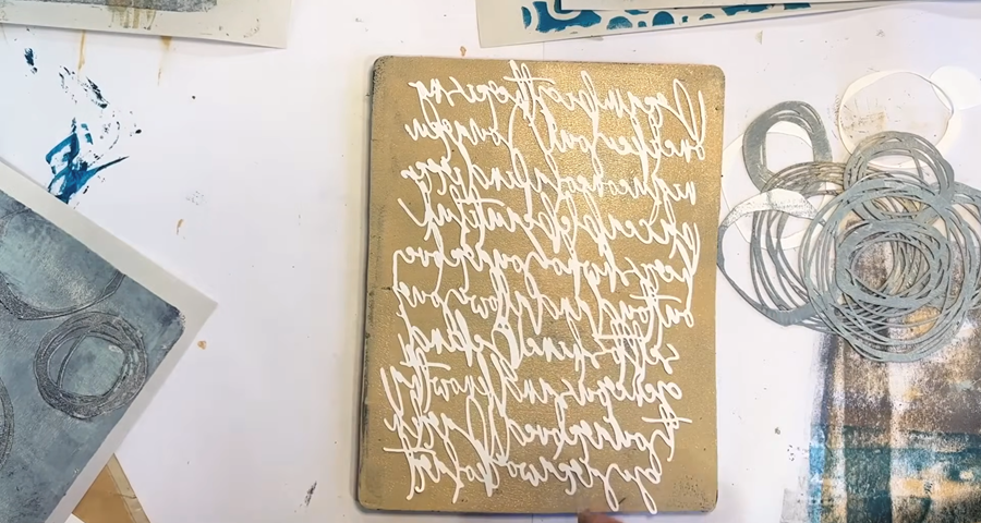
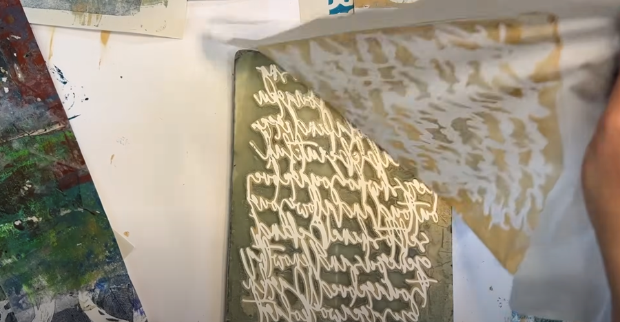
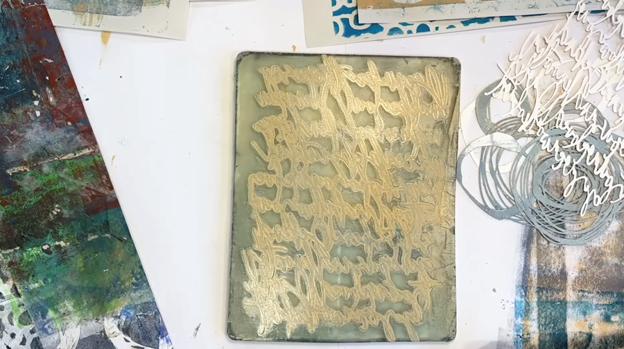
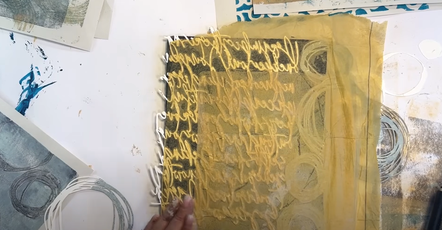
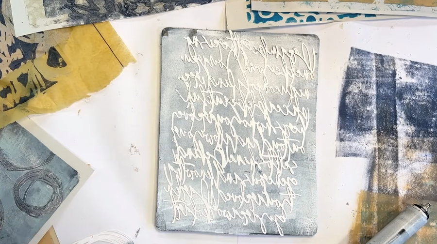
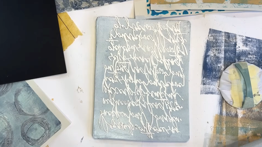
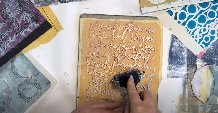
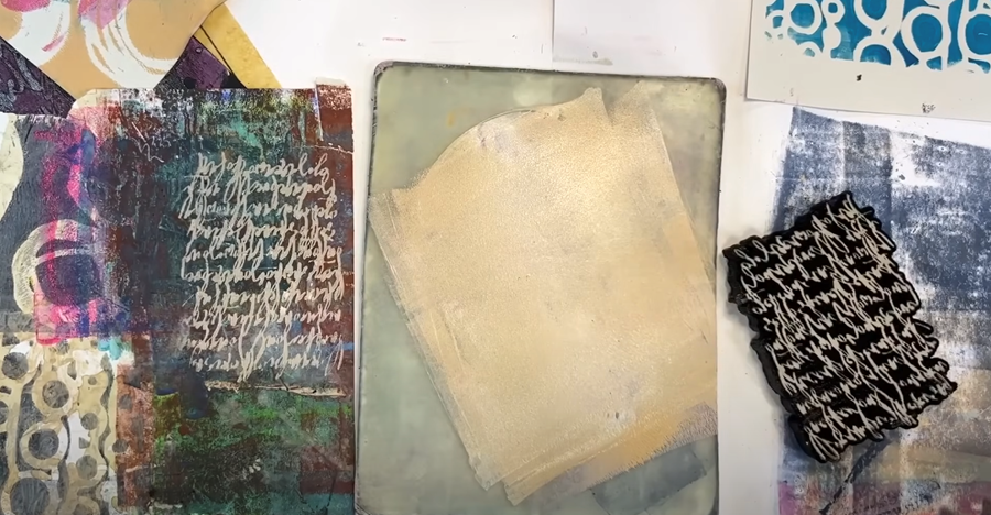
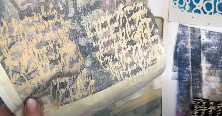
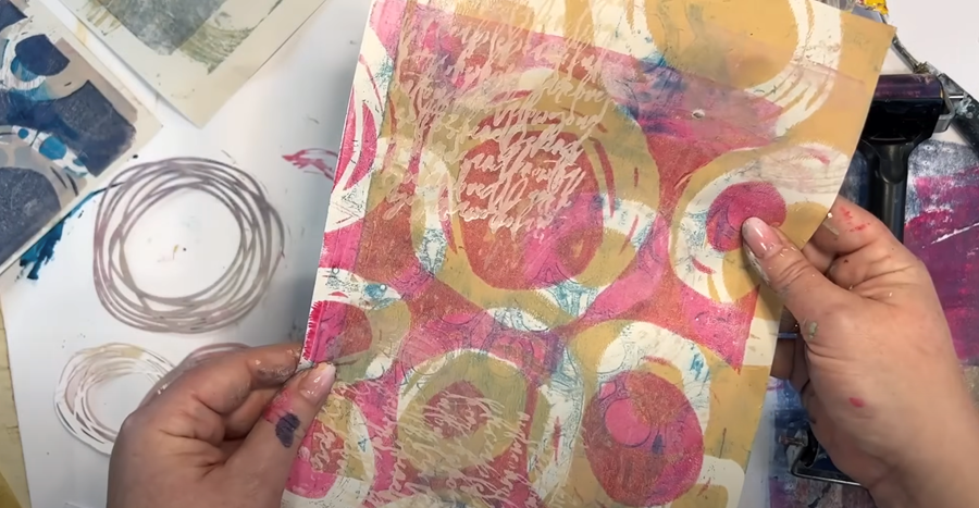
Script Stencil
Now, I’m going to give this stencil with the script on it a go, using some of my yellow paint.
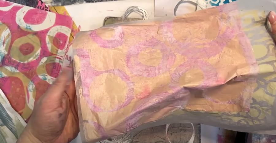
First, I pull up the initial print onto one of my large coffee-stained papers.
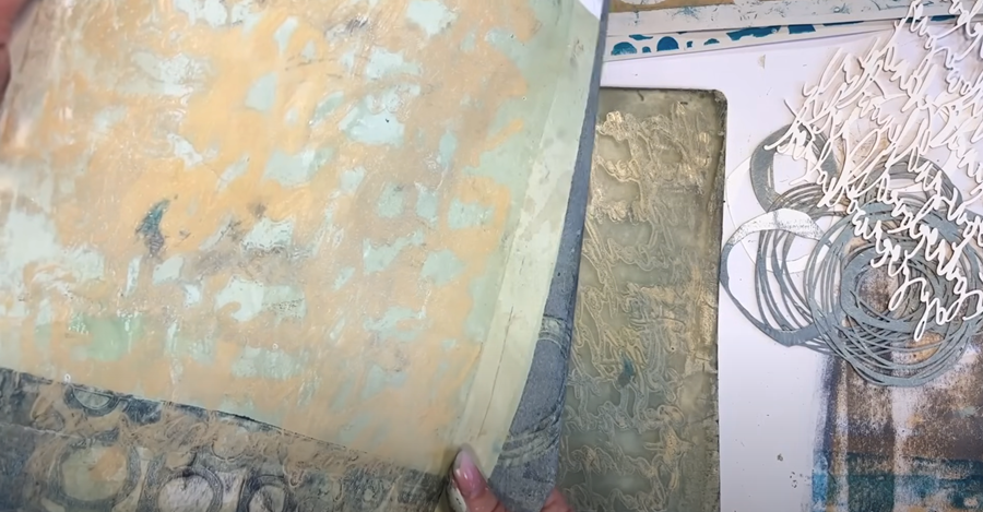
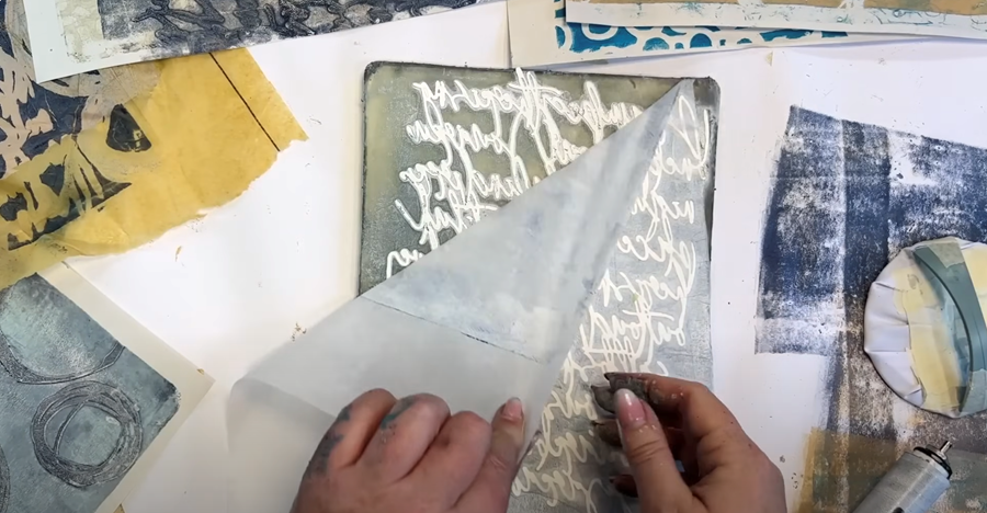
Next, I take a piece of wet-strength tissue to lift the excess paint. The tissue is so translucent, and with the negative space created by the stencil, it will make a brilliant layering piece over a darker print in a future project.
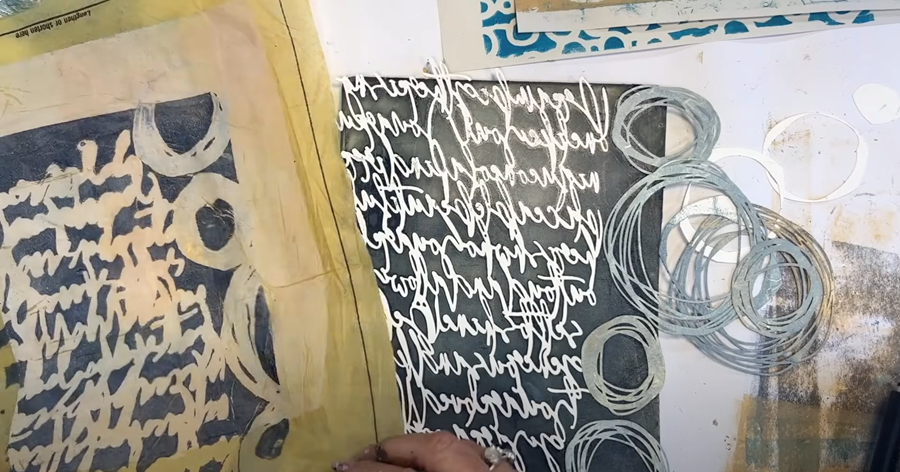
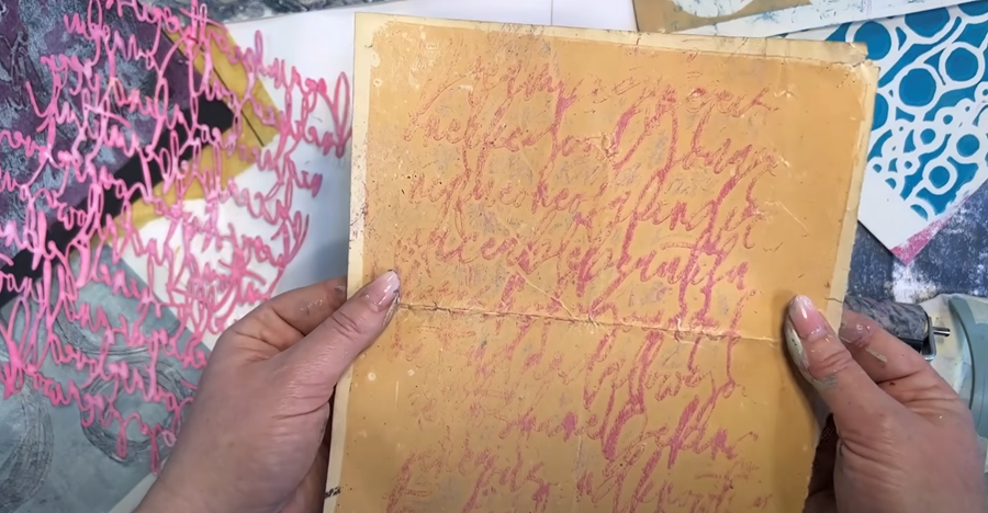
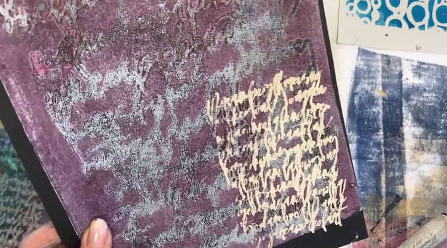
Then, I remove the stencil and pull the print over a blue section of my paper to see what happens.
It wasn’t quite as successful with this colour combination, so I’ll try a darker colour next to see if I can get a better result.
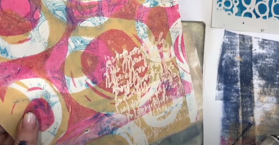
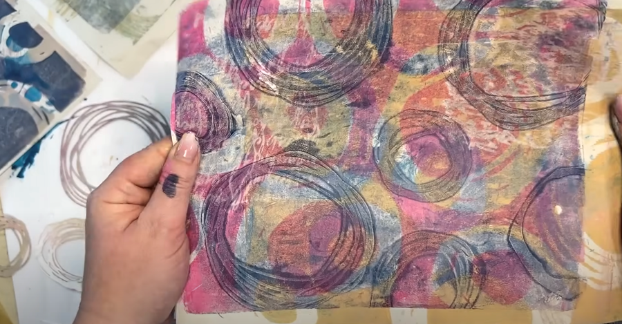
Nested Circles and Script
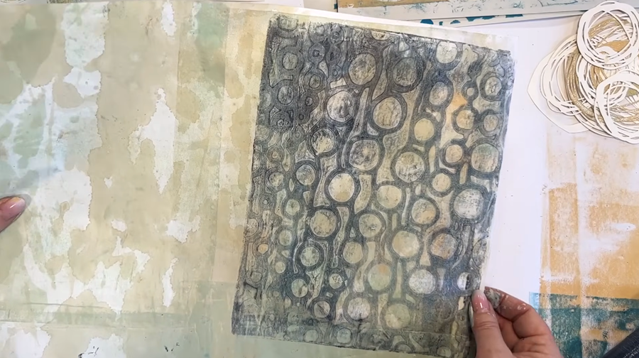
I’m going to combine the nested circles with the script stencil in one print, using a thinner layer of Prussian blue.
This time, I’ll use the dressmaking paper with a beige base layer on it. I’ve slightly offset the paper to create some visual interest in the print.
As I suspected, the image is much clearer when I use a darker colour. The contrast is lovely, and the layers from both stencils give it a beautiful texture.
I remove all of the stencils and pull the remaining paint onto a lighter print I made earlier.
For the ghost print, I layer it over a ghost print that was already on my larger sheet.
I think both prints turned out quite nicely!
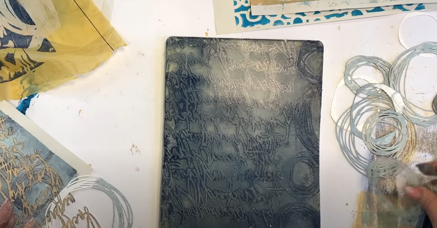
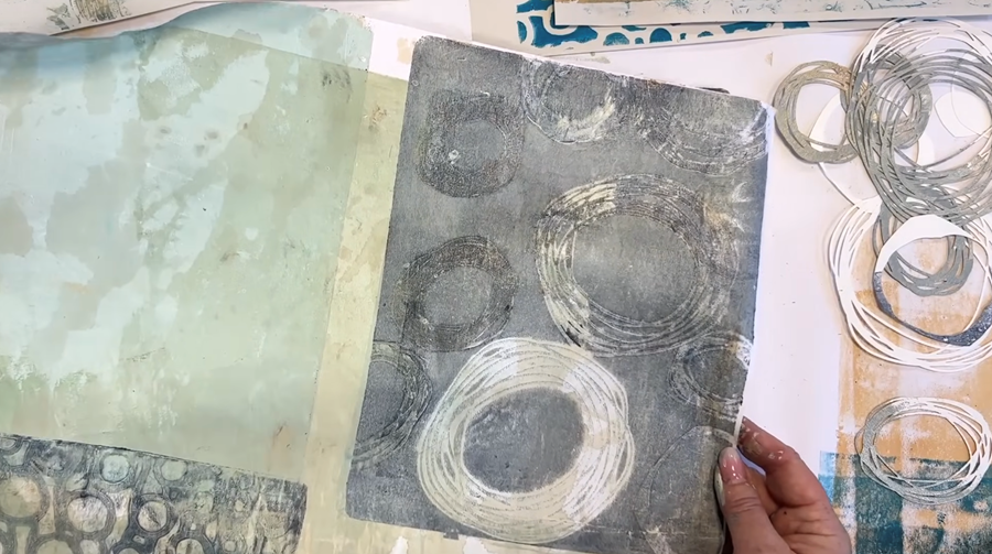
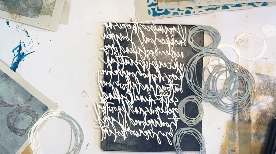
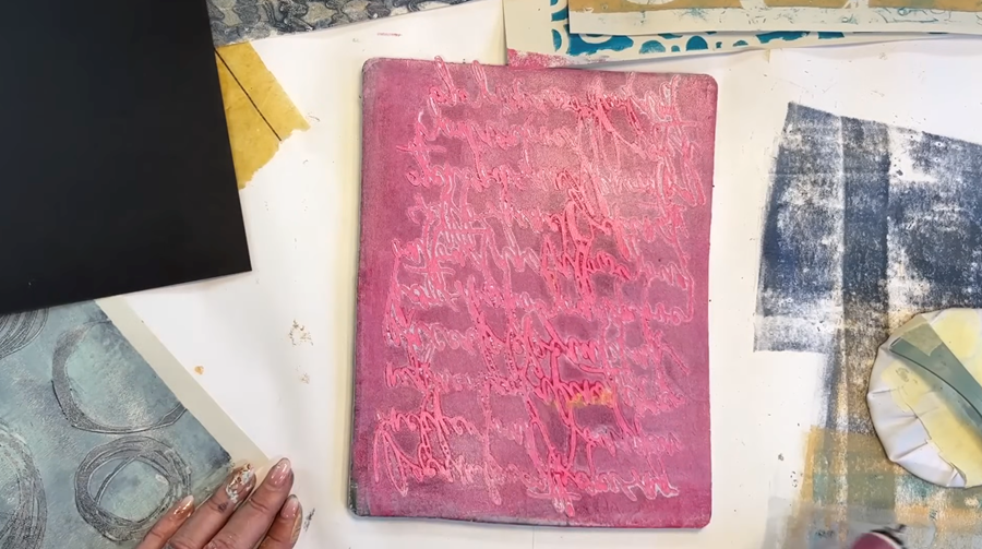
Next I’m trying out white paint with the stencil to see how it looks over a dark background.
I start by using some tissue paper to lift the excess paint, then remove the stencil, and pull the print over a darker section of my large sheet.
The result isn’t quite as crisp as I’d hoped—it might be because I’m layering it over existing paint—but it still adds an interesting layer of texture to the piece.
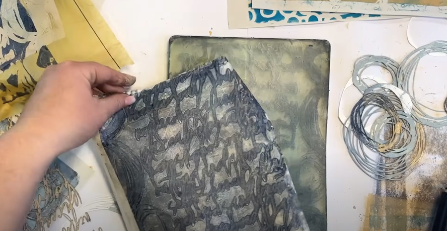
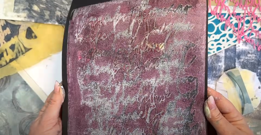
I’m going to give this another go, but this time on a piece of black card. The process is the same: I apply a layer of white paint to the Gelli plate, lay the script stencil on top, and lift the excess paint with tissue. Then, I roll on some pink paint for a pop of colour.
After removing the stencil, I press the black card onto the plate.
The definition still isn’t quite as sharp as I’d like, but the pink is a nice pop of colour against the black.
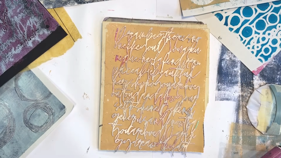
Now I’m trying something a bit different—using the stencil more like a stamp to print an impression directly onto the paper.
I take the script stencil, which still has a touch of wet paint on the back, and place it onto one of my beige coffee-stained papers. Then, using a clean brayer, I roll over it to transfer the paint.
I think the effect is quite cool! It adds a lovely, subtle texture, so I’m going to keep experimenting with this stencil-as-stamp approach and see where it takes me...
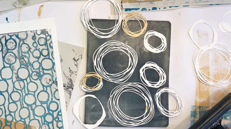
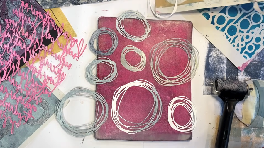
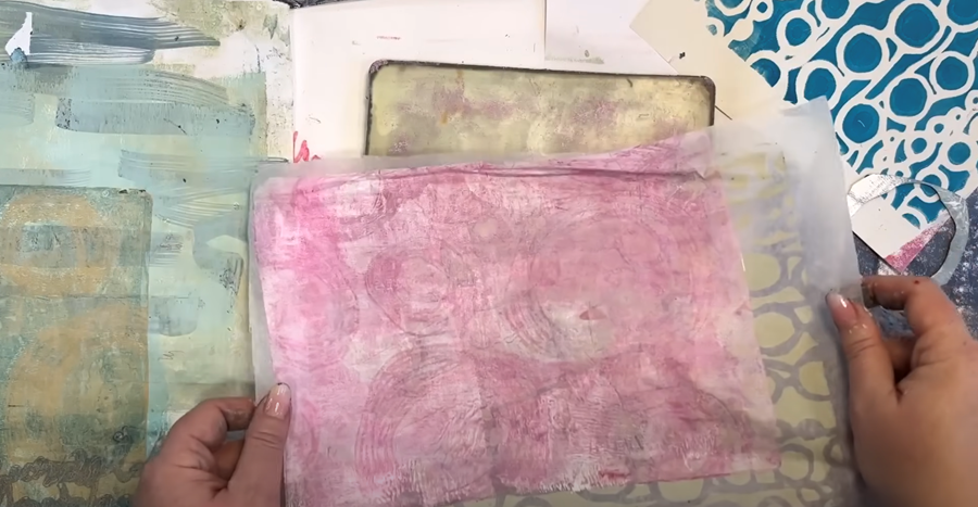
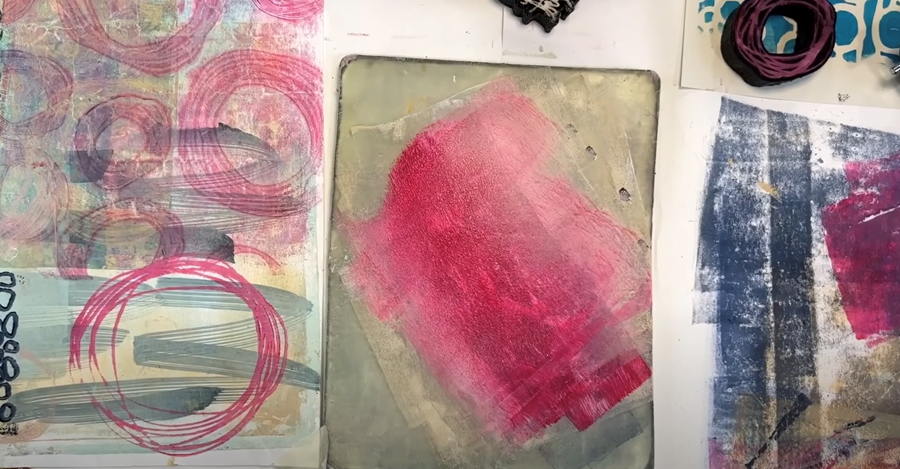
Now I roll some pink paint onto the gel plate and arrange my nested circle stencils across the surface.
I pull the paint onto one of my earlier base layers.
After removing the circles, I pull the ghost print onto one of my large printed sheets. It adds a gorgeous pop of colour!
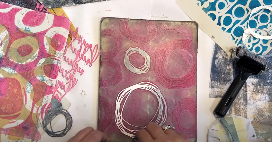
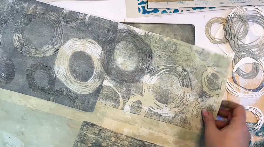
Now I’m just capturing those pink circle shapes left on the Gelli plate—the ghost prints—by rolling a layer of white paint over them.
I place a piece of wet-strength tissue paper I’d printed earlier on top, and when I remove it, the two layers lift together beautifully.
It creates a soft, layered effect.
Now I’m rolling a layer of beige paint onto the Gelli plate and laying the circle stencils over the top.
Then, I reuse the same piece of wet-strength tissue paper I just printed on to pull another layer.
It’s brilliant how many layers you can build up on this tissue!
Finally, I’ll pull the ghost prints onto one of my larger prints.
The little hint of pink really helps to add a bit of warmth into areas that might need it.
Step 4: Adding Layers With Stamps
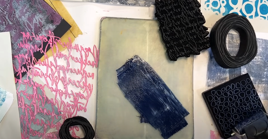
Pebble Stamp
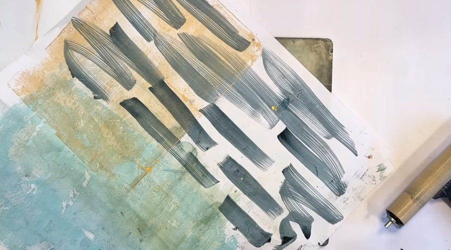
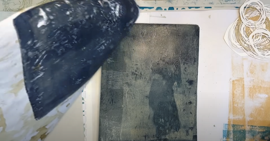
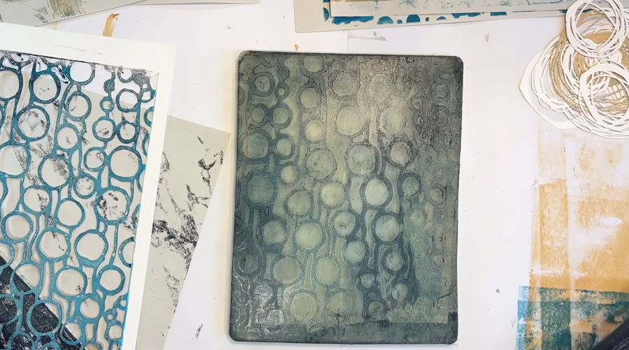
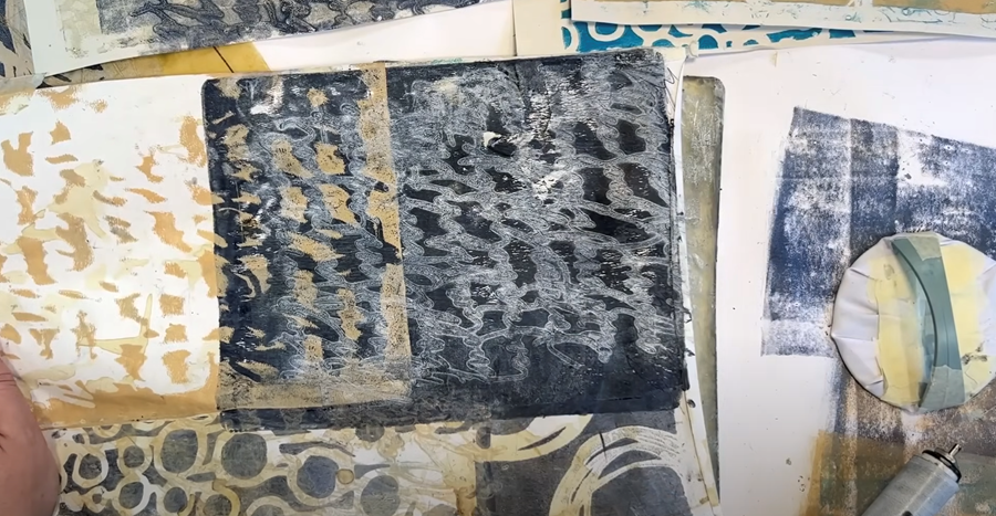
Next up, I’m going to give the stamps a go. I’ll start with this pebble-shaped stamp paired with a darker colour.
I roll some Prussian blue onto my gel plate, then pick it up with the brayer to roll onto the stamp.
TIP: I found that the third print worked best—it had less paint on it and gave a cleaner shape.
I think it looks pretty cool!
These stamps are fantastic for adding another layered element to my prints. I’m really pleased with how they're turning out!
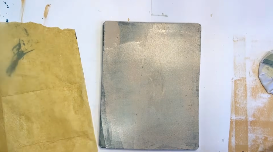
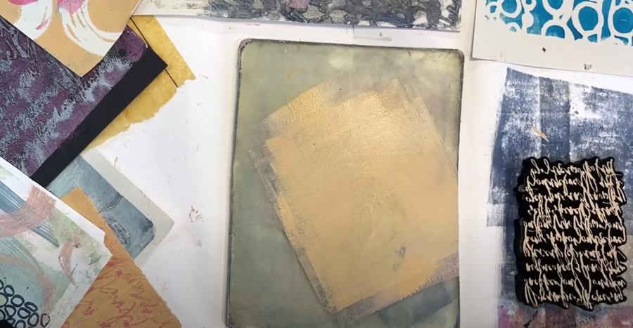
Before I move onto a new stamp and colour, I want to clean up the leftover blue paint from my gel plate using a blank sheet of paper. This can be saved for use in another printing session—nothing ever goes to waste!
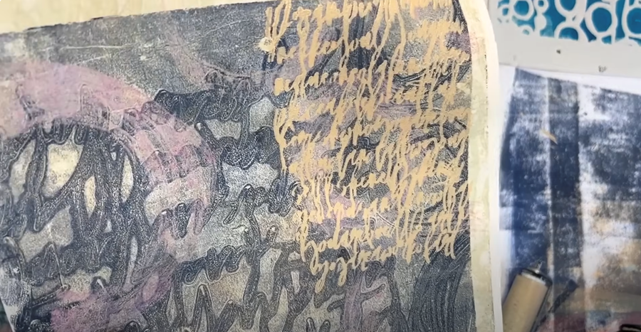
Script Stamp
Now that my Gelli plate is nice and clean, I’ll add some yellow paint and try the script stamp.
I’m really pleased with how this is turning out—the yellow creates such a lovely contrast against my prints, particularly the darker areas.
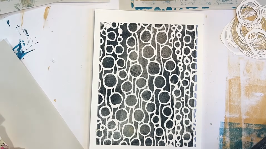
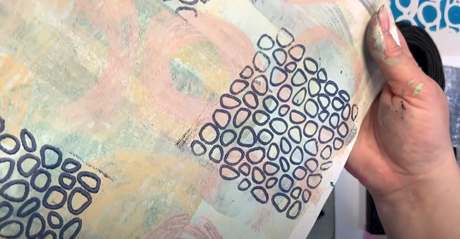
Nested Circle Stamps
Last, I’m giving these circular stamps a try to add some pops of pink to my prints.
The stamps themsleves are great, but I'm not entirely sure about my placement on this print, to be honest so I use a damp cloth and remove the paint while it's still wet.
TIP: Don't be afraid to remove the paint if you don't feel it's a good fit. That’s the joy of experimenting—it’s all about playing around and seeing what works best!
Next, I try the pink on a bolder print, and yes, I’m happy with how it looks here!
I'd say the stamps are a success!
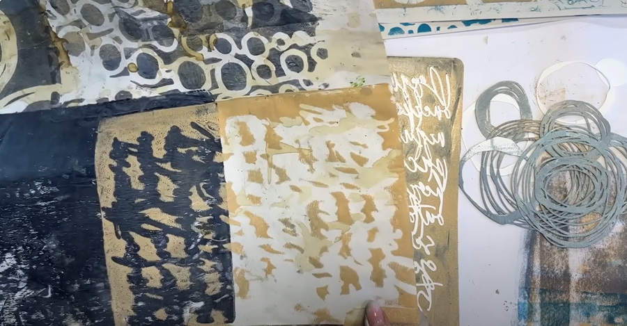
How to Repurpose Gelli Prints You Don't Love
Printing is quite an intuitive process, but not every print will turn out exactly as you’d hoped. Having all your papers laid out in front of you as you work is helpful - it lets you spot which ones might need a little something extra.
Even so, it’s not uncommon to end up with a few papers at the end of your session that make you think, “What on Earth am I going to do with this?”
The best way to turn a print you don't like around is either to go over it with a really dark colour or a really light one. Just make sure to apply a nice thick layer of paint to the Gelli plate.
This print is a good example of one that just didn't work, so I'm going to use my Prussian blue and our circle stencils to rescue it.
This one’s a bit of a disaster too, so I’m going to tone it down with some dark blue and soften those bright areas a bit.
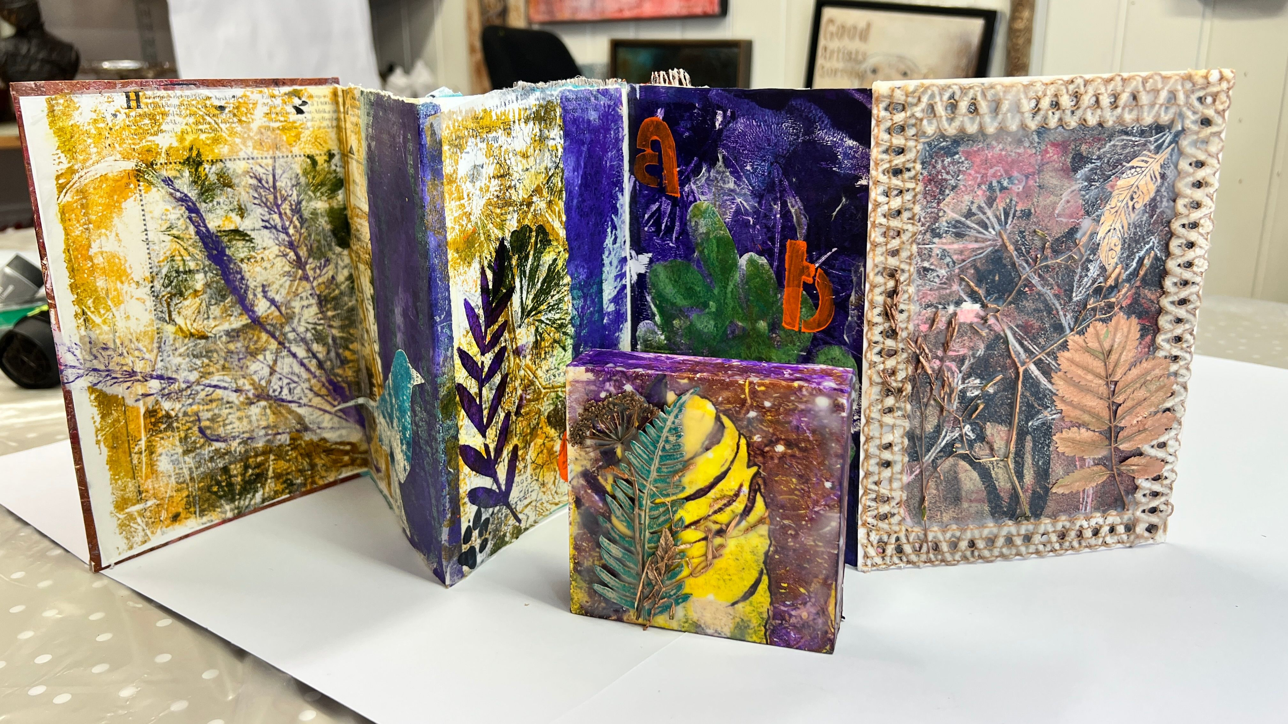
All in all, this printing session has been brilliant! I’ve ended up with a lovely selection of papers, all ready to transform into finished pieces, and I’m especially pleased with how well the new stencils and stamps worked. A big thank you again to Patricia and Maria from PM Artist Studio!
They’ve kindly offered a little something for you too—a 10% discount if you spend over $35.
Use the code SMAFAN10 at checkout to claim it!
In Part Two, How To Create A Painting With Gelli Printed Papers, I’ll show you how I use these stenciled papers to create a finished design.
If you’d like to learn more, sign up to my newsletter so you never miss what's new, or take a peek at my tutorial Experimenting With Botanical Gelli Prints.
I also offer a FREE course called The Essence of Landscape, where I teach how to turn your prints into finished paintings.
Happy printing!
We hate SPAM. We will never sell your information, for any reason.