Opaque vs Transparent Paint for Gel Printing: A Quick Guide
Nov 14, 2025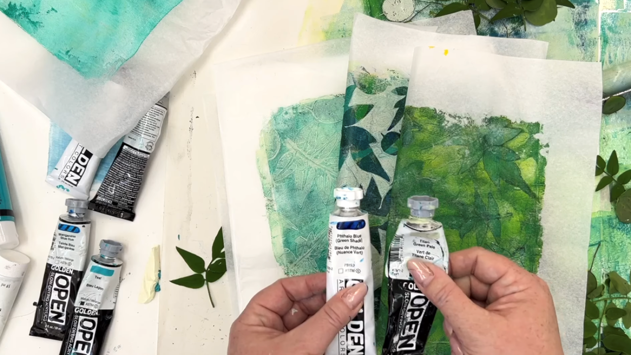
Not sure whether to use opaque or transparent paint in your Gelli prints? If you’re just getting started, you might not know the difference between these two types of paint - but don’t worry. In this post, I’ll walk you through what sets them apart and show you how to get the best of both on the gel plate.
I’ll also show you a quick way to check your paint’s transparency, and how using the same materials - botanicals, Golden acrylics, and my very favourite tissue paper - can give you three totally different effects, just by changing how you layer opaque and transparent paints.
Whether you’re new to Gelli printing or just want to understand your materials better, follow along for some helpful tips and inspiration!
Watch the full video tutorial here:
Materials You’ll Need:
Paper:
Wet-strength tissue paper: Carnival is my favourite brand. I love using it for layering.
Gel Plate:
For this video, I’m working with an 8 x 10 Gelli plate, which is a great all-around size for a variety of prints.
Brayer:
You’ll need a rubber roller, called a brayer, to layer the paint across the plate. I'm using a 15 cm brayer and I like having 2 on hand so that I can change paint colours.
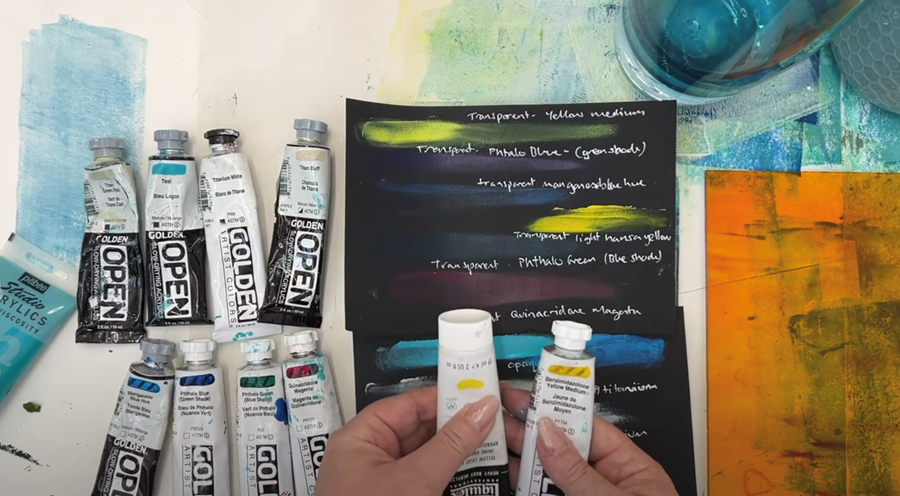
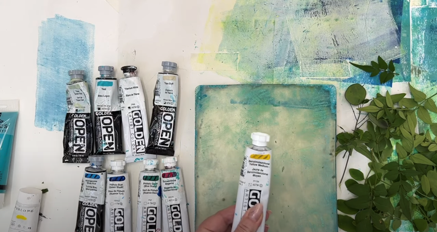
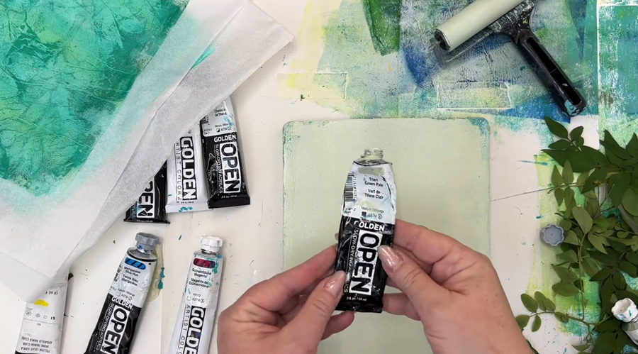
Acrylic Paint:
I'm using Golden Acrylics in Phthalo Blue (Green Shade), Phthalo Green (Blue Shade), Yellow Medium, Teal, Titan Buff, and Titan Green Pale. I'm also using Daler-Rowney's Titanium White.
Botanicals:
I'm using an assortment of fresh, flat, leaves in a variety of sizes and shapes.
Please note: As an Amazon Associate, I earn from qualifying purchases.
What do opaque and transparent mean?
First, let's have a quick chat to understand opacity and transparency.
Think of a piece of stained glass - you can see through it, right?
That’s transparent.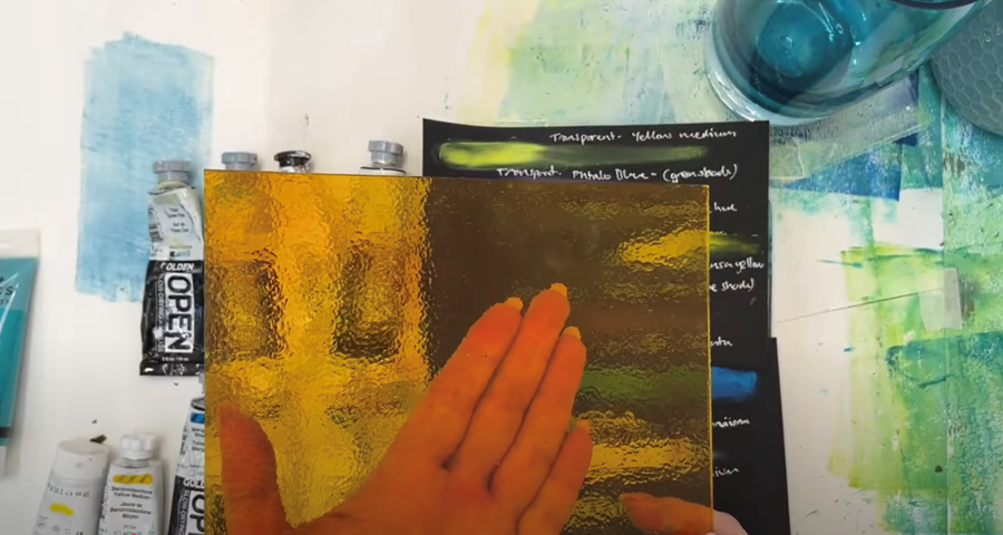
Compare that to this lovely ceramic vase.
It's solid - you can’t see through it.
That’s opaque.
![]()
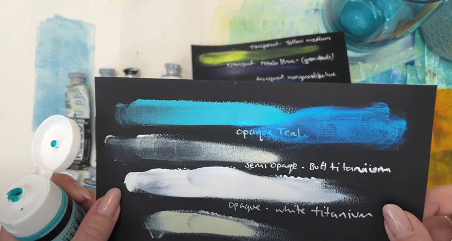
A really quick way to see if your paint is opaque or transparent (so you know how it's going to react) is to test it on a piece of black paper.
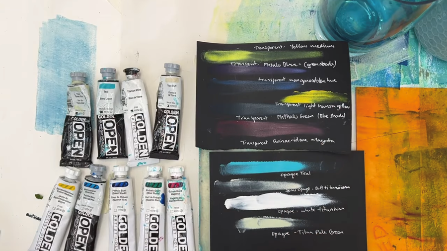
Here, I’m testing some tubes of acrylic paint by Golden Paints.
Their labels make it really easy to figure out transparency.
See that small black square on the label of this Teal paint?
That means it’s opaque.
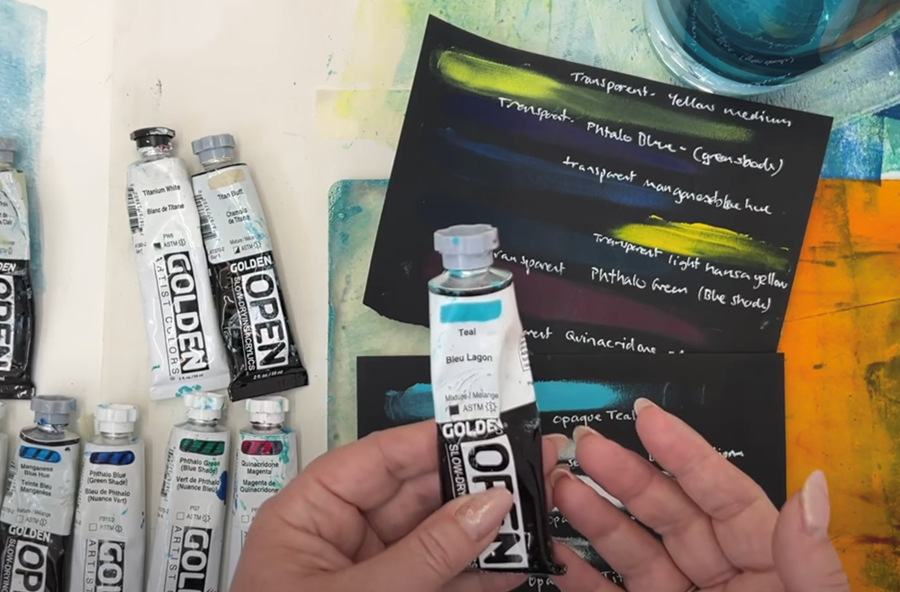
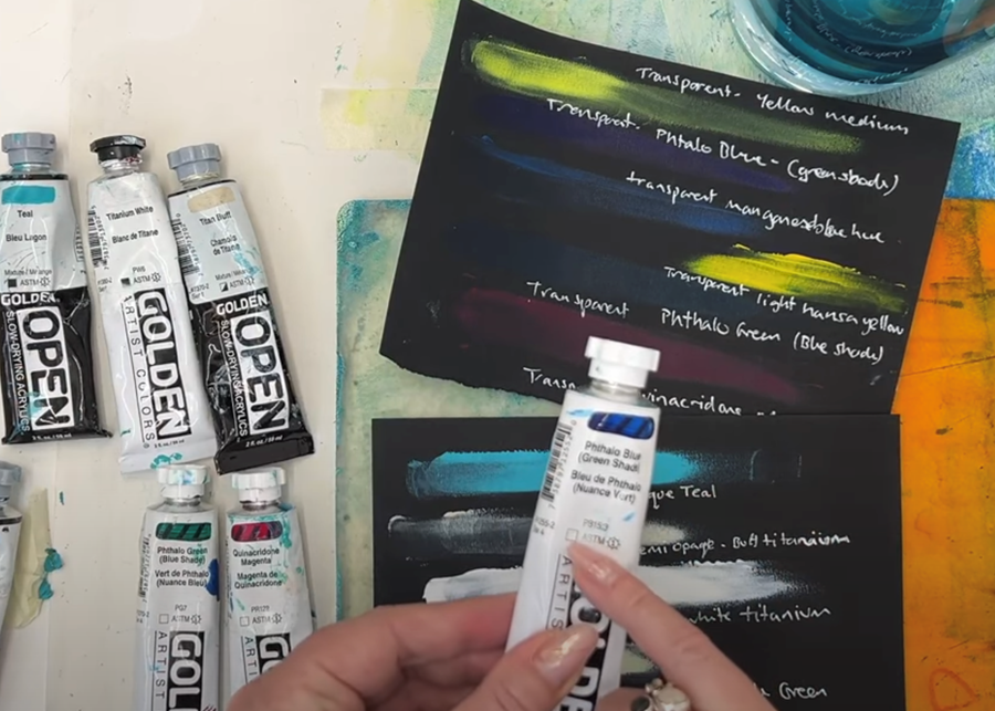
However ... if the square is empty, like it is on this tube of Phthalo Blue, it means the paint is transparent.
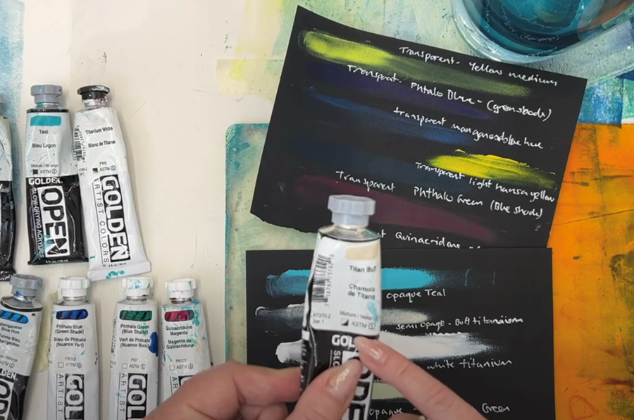
If the square is half-filled in, like it is on this tube of Titan Buff, it’s a semi-transparent paint.
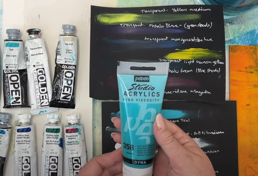
Other paint brand labels can be a bit more confusing. Take this DYNA paint by Pebeo Studio Acrylics, for example.
It’s metallic and reflective, but the label doesn’t say if it’s transparent or not.
If you’re unsure, a little test on a piece of black paper will give you a good idea.
Here, I’ve applied a thin layer, and you can see it’s quite transparent - you can clearly see the writing underneath the paint.
Yellow paints tend to be quite transparent too. Even so, they really pop on dark surfaces.
The black paper test is a quick, easy way to really help you understand how the paint you're using is going to work.
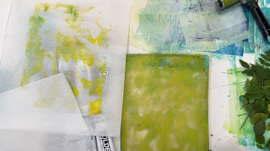
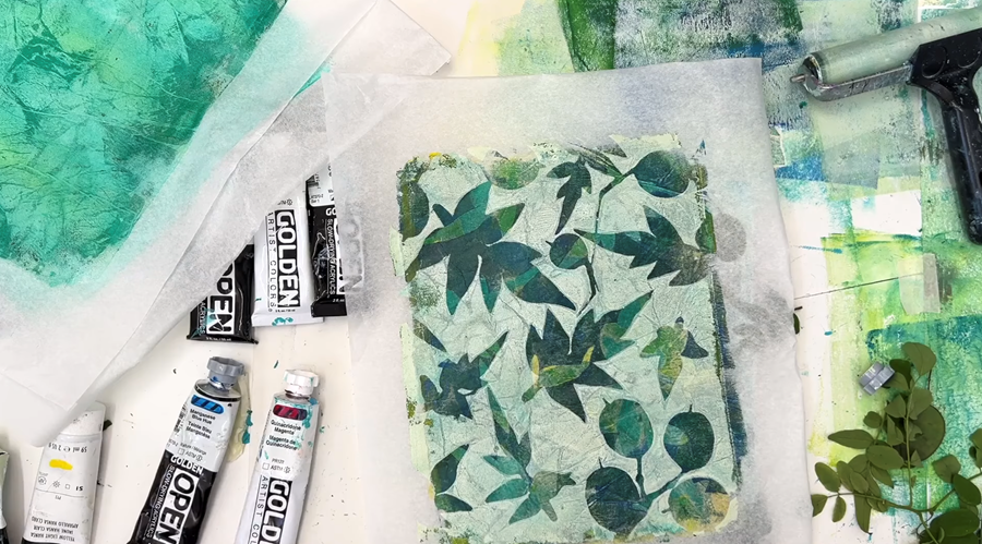
Print 1
Let’s get printing!
I’ve got some plant materials ready, along with my gel plate, my brayer, and several clean sheets of Carnival wet-strength tissue paper.
I’m starting off with a semi-transparent yellow. This one’s Golden Yellow Medium, but honestly, any transparent acrylic paint you like will work just fine. (Note: I didn't realise when I was filming but this particular yellow is semi-transparent - This is indicated by a black line through the centre of the box)
Yellow’s actually one of the more powerful transparent colours, so it’s a good one to start with.
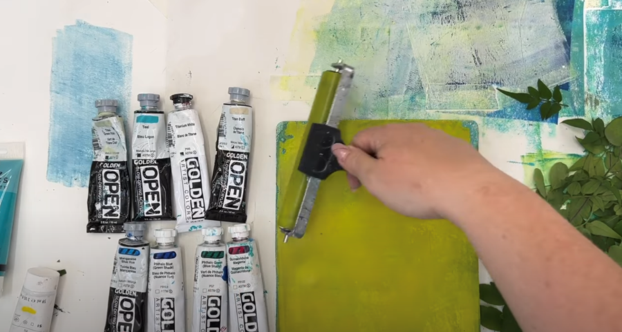
Because it is so strong, I'm rolling out quite a thin layer on my Gelli plate.
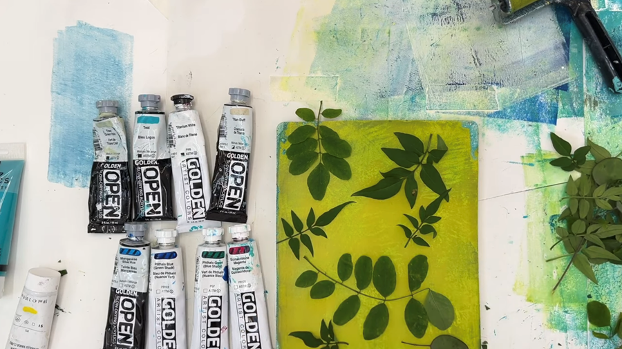
Now I’ll lay some leaves on top of the paint layer to create a silhouette.
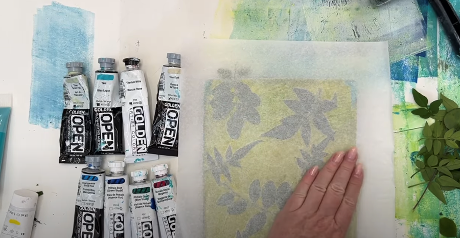
I'm going to use one of my favourite papers, Carnival wet strength tissue.
It’s brilliant, especially if you're building up layers, because it won't rip or tear and it picks up loads of detail.
I’ll give it a wipe with my hand to smooth it out and make sure it’s had good contact with the paint, especially around the leaves, before gently peeling it back.
It's a warm summer day here at the studio. The paint’s drying pretty fast, so I remove the leaves right away.
Then I lay down a fresh bit of paper, give it a gentle smooth with my hand, and lift it off.
That one didn’t pull much, but that’s okay. We can use this as a base layer for another print.
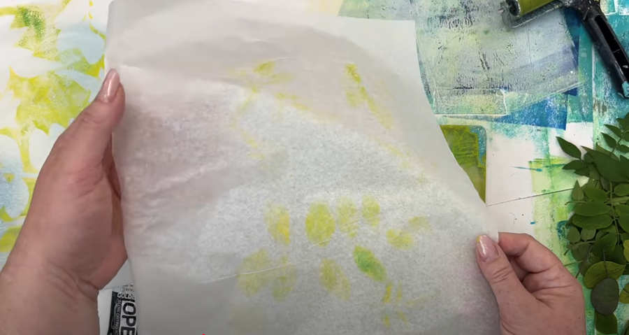
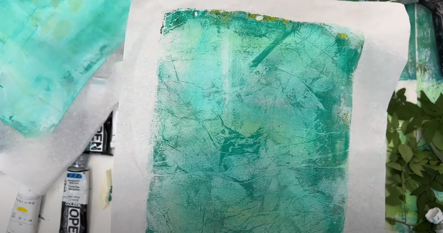
Next up, I’m using Golden’s Phthalo Blue (Green Shade), another transparent colour that’s perfect for layering.
I roll out a nice thin coat on the gel plate, just like before, and place some more of my botanicals on top.
Now I’m going back to that first print we did and placing it over the plate again to start building up some layers.
I gently smooth it out and then carefully peel it back.
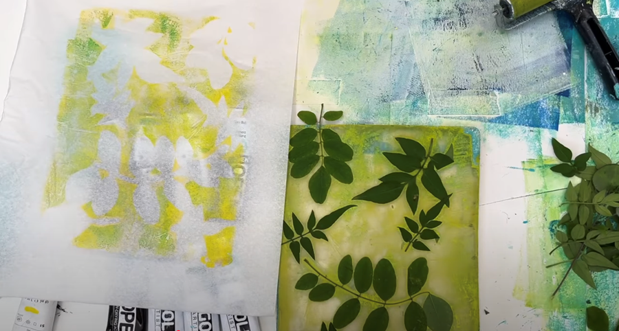
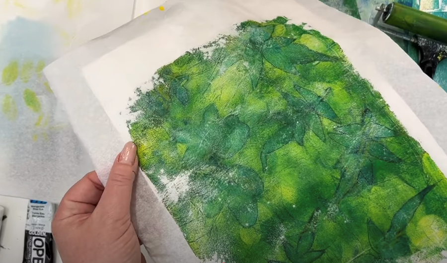
You can see we’re getting a lovely green colour coming through because the blue and yellow are mixing.
It’s almost like screen printing in that way: when you’re working with transparent colours, they blend beautifully, right there on the print.
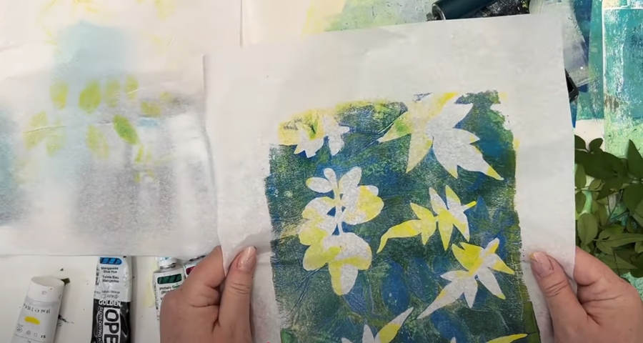
Now I’ll gently remove the leaves. This time I want to layer a bit of yellow over the leaf imprints.
It should give us more of that lovely fresh green colour.
I’m using a clean sheet of paper for this pull so I have a better chance of lifting off all the paint from the plate.
That’s quite nice! You can really start to see those lovely layers building up now.
That’s the magic of transparent paint!
Tip: Pop your tissue over a piece of plain white paper - it makes the print a bit easier to see.
Print 2
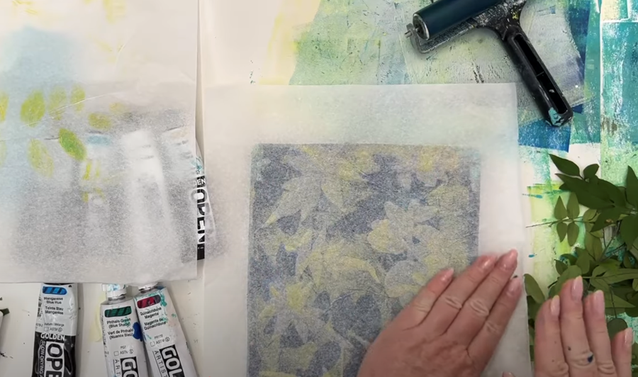
What I might do next is go back to that blue and yellow print.
I’m not loving all those open white areas. They feel a bit unfinished to me, so I’m thinking of adding a glaze layer over top, just to bring everything together.
I'm going to use another transparent colour, Phthalo Green (Blue Shade). You’ll still see the blue and yellow underneath, but it’ll feel more cohesive.
I’m going to roll out a thin, even layer.
This time, I’m not adding any plants. I just want it to act like a wash of colour that softens and blends what’s already there.
Now I place my print down on the plate, and gently press, especially over those white areas I want to tone down.
This glazing technique helps to build up those transparent layers, without covering up what’s underneath.
Cleaning off the Gel Plate:
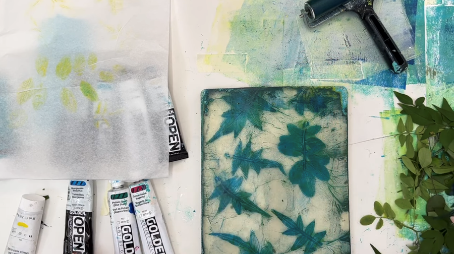
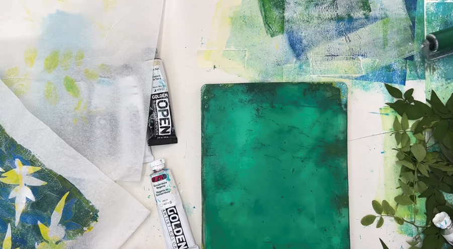
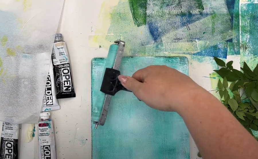
I'm going to add an opaque layer on top of that print, but first, I need to clean some of the paint from my gel plate.
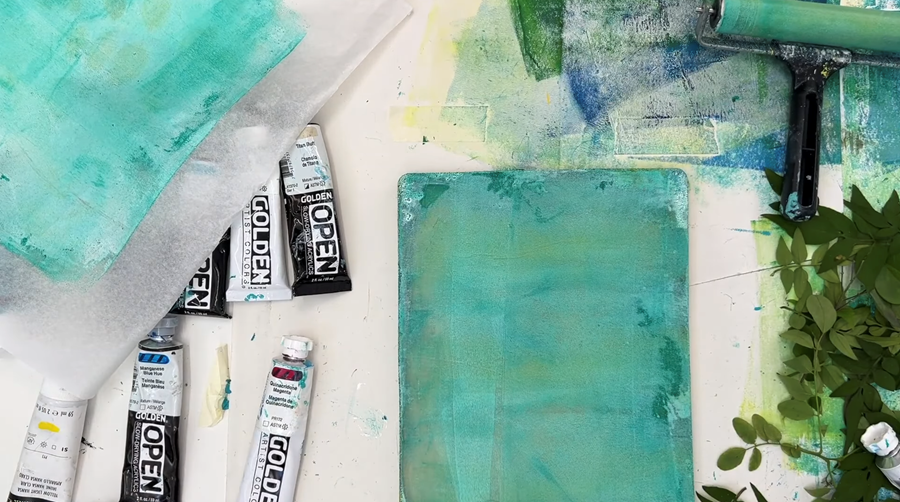
I’m using a thin layer of Daler Rowney Titanium White. It ends up blending with the leftover green colour on the plate, turning into a really soft teal.
I pull that onto a piece of tissue paper. It’s a nice way to get something useful out of the cleaning process, and I can use that print later as a base layer.
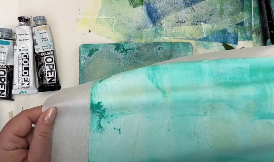
There's still a lot of leftover paint on the roller, so I do one more pass on the gel plate.
I pull that up too, again using tissue.
These grungy underlayers are some of my favourites! They give such beautiful texture and make great bases to build on later.
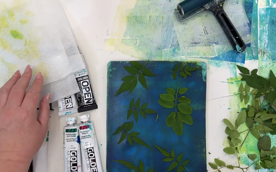
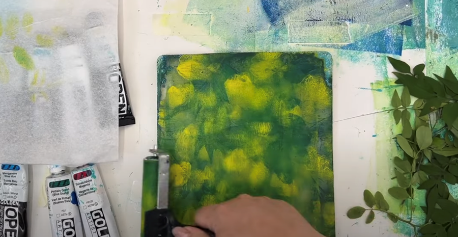
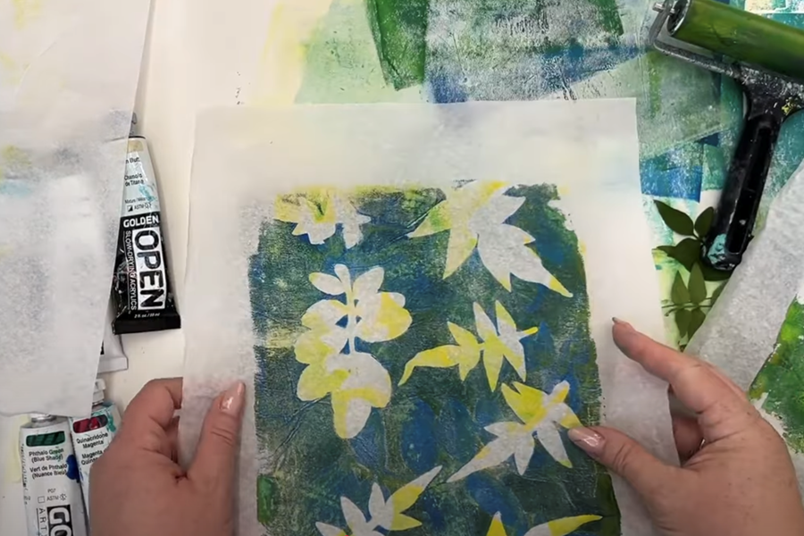
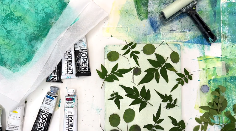
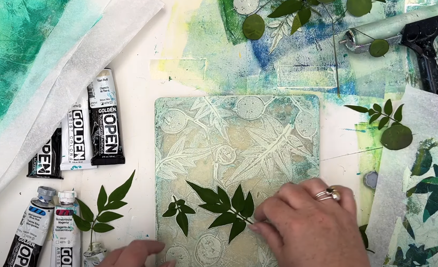
Now that my plate’s clean, I’m going in with a layer of Titan Pale Green, an opaque colour.
It's also a Golden Open Acrylic, which means it has a slower dry time, giving me a bit more time to work.
Because it’s opaque, it’ll completely block out some areas of the print, so you’ll really see the difference compared to the transparent paints we’ve used so far.
I'm just rolling out a thin layer across the gel plate, and then placing a few more botanicals to fill the space.
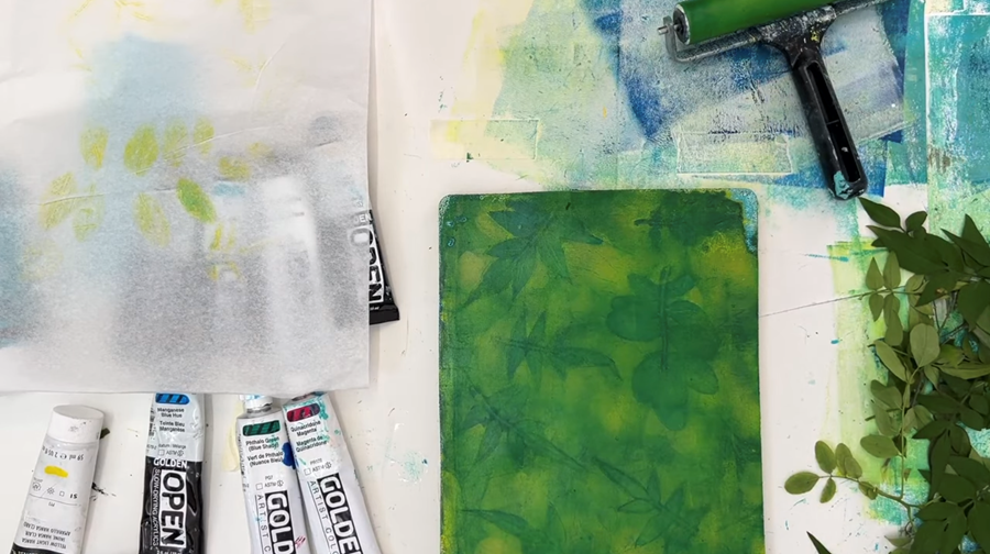
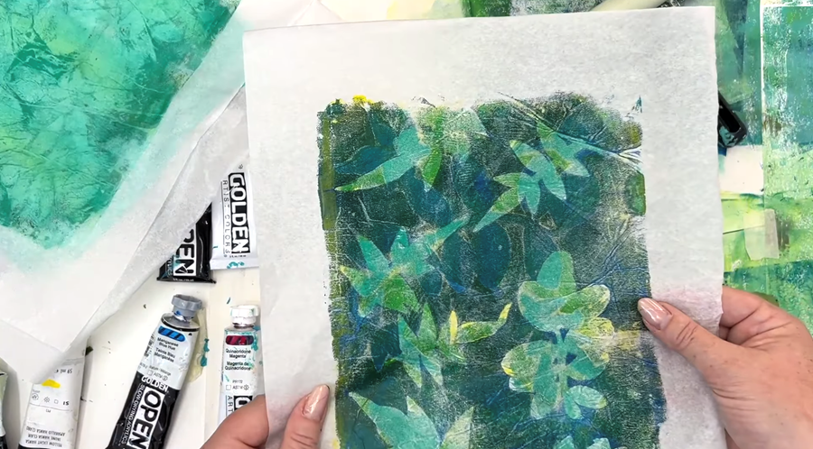
Then I take my earlier print and lay it carefully over top of the opaque paint.
I press gently, especially around the leaves, to get a nice clean silhouette.
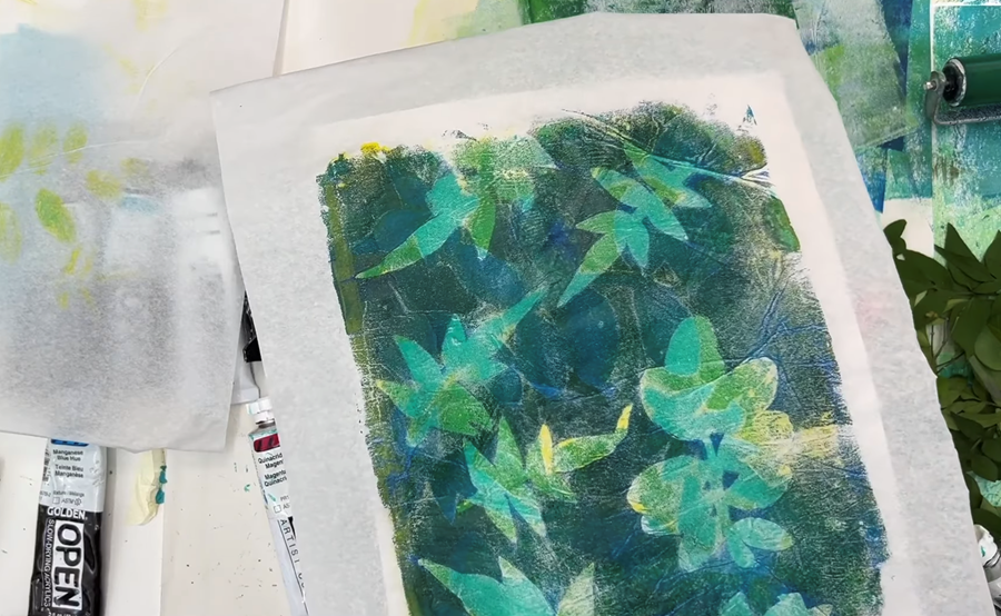
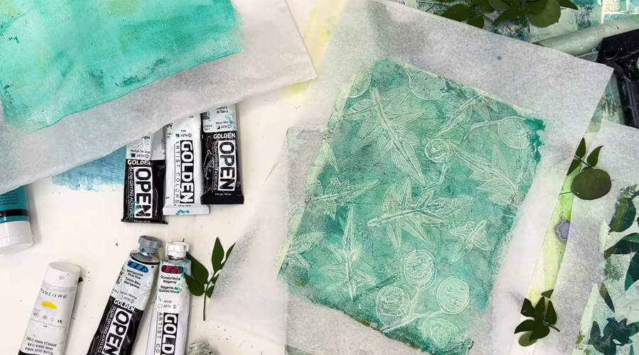
Now for the reveal!
You can really see that opaque Titan Green layer sitting on top. Any areas where it touched the paper are fully covered, but in the open spaces, all those lovely transparent layers still peek through.
Print 3
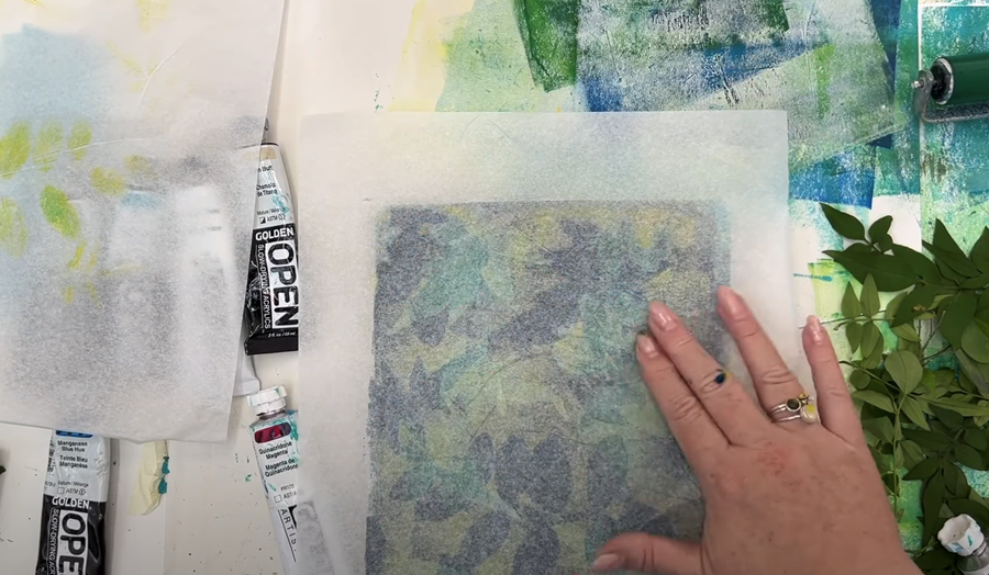
Now I carefully remove the leaves and get ready to pull the secondary print, also known as the ghost print.
For this, I’m using one of the solid teal prints I pulled when I was cleaning the Gelli plate. It'll make a really nice base to catch those leftover details.
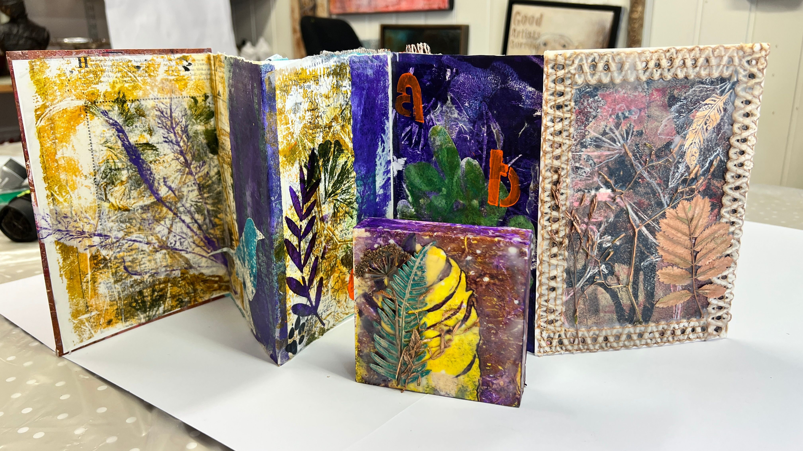
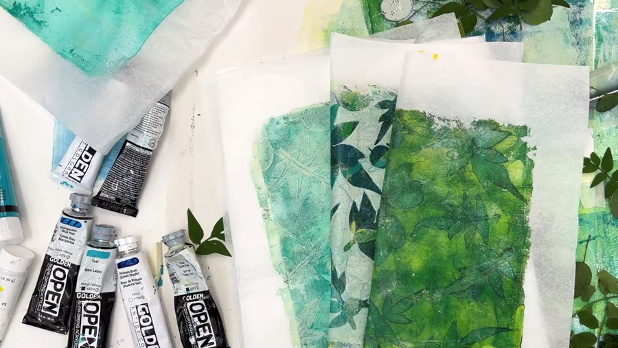
When you put them side by side, it’s hard to believe these three prints were made using the same materials!
I used the same gel plate, the same paper, the same botanicals, and even the same paints - just layered and used in different ways.
It really shows how much variety you can get simply by playing with transparent and opaque colours.
Thanks for stopping in - I hope you’ve picked up a few helpful tips to inspire your own Gelli printing.
If you’d like to learn more, sign up to my newsletter so you never miss what's new.!
I also offer a FREE course called The Essence of Landscape, where I teach how to turn your prints into finished paintings.
Happy Printing!
We hate SPAM. We will never sell your information, for any reason.